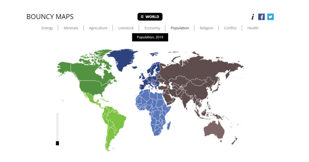
Bouncy Maps is a website where users select subjects related to people, planet, business, politics, and living and watch the countries on the map change their size instead of land mass, the size of each country represents the data for that subject.
A regular map shows you how large countries are. Bouncy Maps take a different angle. They transform the map to show how large countries would be if not area were the key, but another criterium. For each dataset different countries will be large or small. Bouncy Maps visualize these new proportions.
Countries (or states or provinces) are exactly as large as their weight in the dataset. They can therefor be compared. A country which is twice as large on the map as another country, has a value that’s twice as large as the other one’s.
This type of map is called a cartogram, or anamorphosis. Traditionally, cartograms show countries as contiguous shapes, attached to their neighbours. Because of the changes in size, distortion of the country shape will be necessary. For Bouncy Maps we choose to safeguard the shape of a country, detaching it from its neighbours. Our algorithm calculates positions for all countries to maintain as much as possible the angles and distances between them.
Link to the Tool: https://www.bouncymaps.com/