To get an initial feel for the data on the map
What does the map’s legend want to tell me?
Let’s start with a look at a map. Open the following link:
https://www.arcgis.com/apps/mapviewer/index.html?webmap=f5e6469be6c34f2194758b7af02109f3
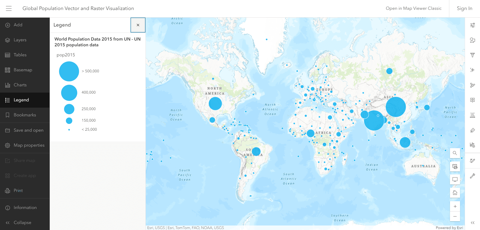
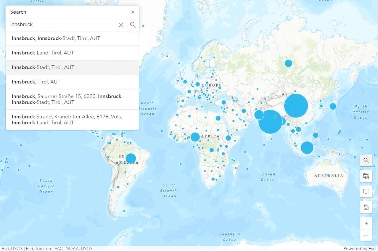
Here you can see a map with some dots and circles. Each circle refers to a specific country. On the left side you can see the legend of the map. What are the circles supposed to tell us? The size of the circle should tell us something about the population of the respective country. The larger the circle, the more people populate the country in question.
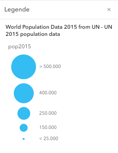
To get the correct numbers, we need to check the legend of the map.
For example, to see the population figure for the United States of America, we click on the corresponding circle on the map.
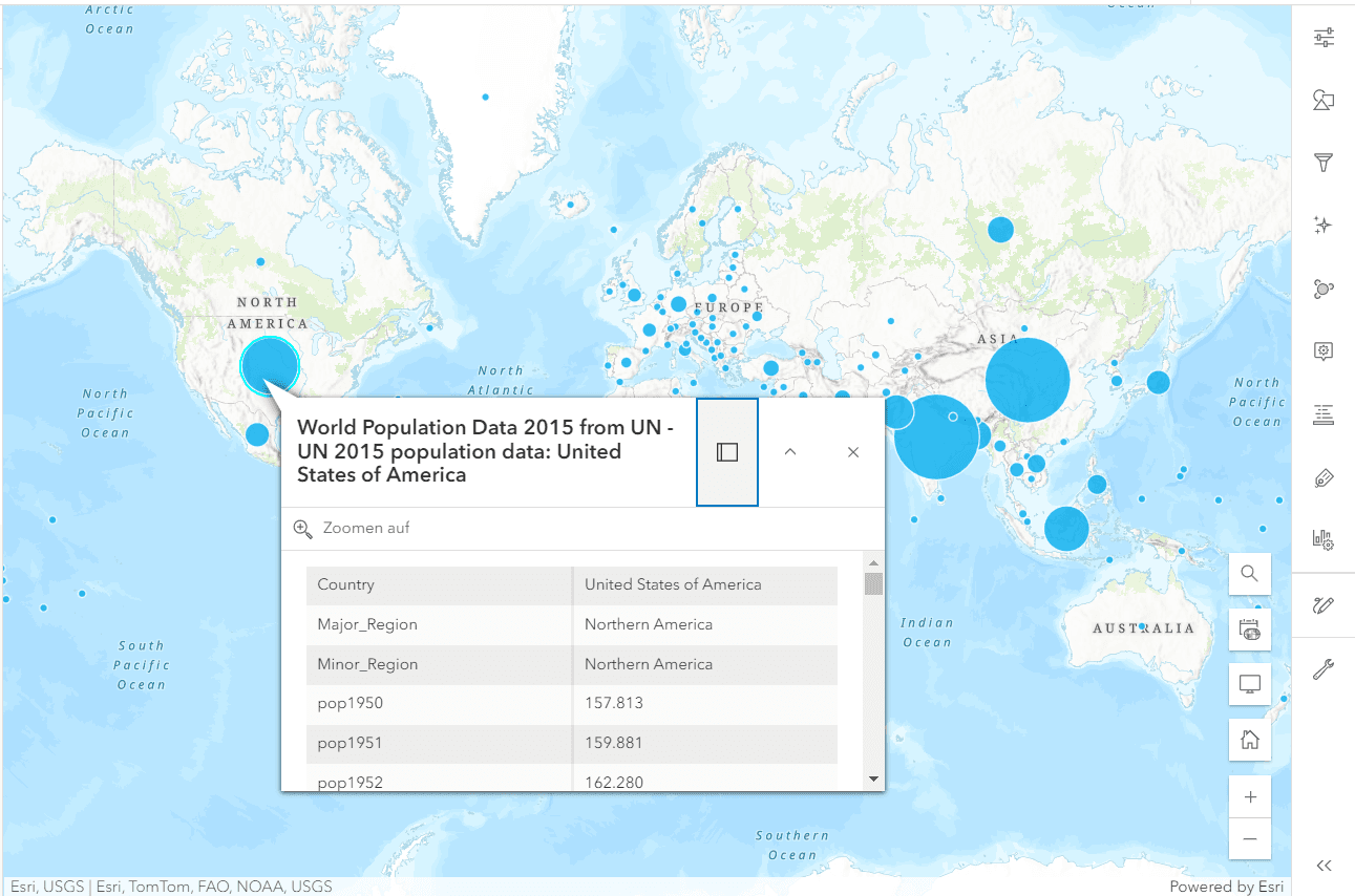
A table with the population data of the United States of America for the years 1950 to 2015 appears.
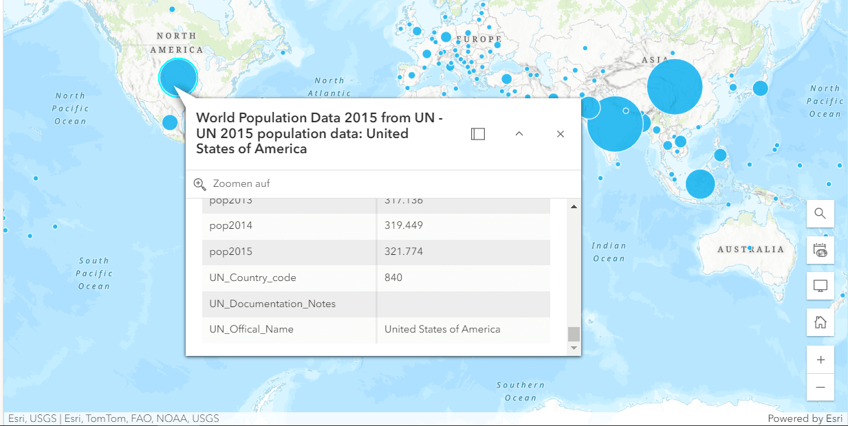
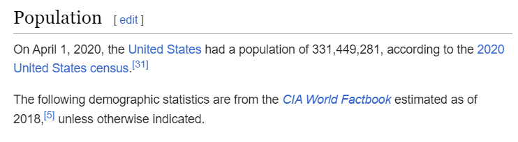
The figure for 2015 is 321,774. The pupils should now consider whether this figure indicates the population of the United States of America. They need reference knowledge for this. What is the population of my own country? How many people live in my city?
More than 100,000 people live in Innsbruck (Austria).
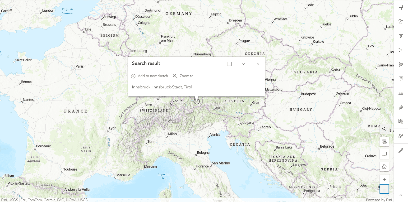
More than 100,000,000 people live in Vienna (Austria).
It makes no sense that more people live in two cities in Austria than in the United States of America.
Unfortunately, the importance of factual knowledge is often underestimated. Knowledge that is in the heads of students without the aid of online resources would be a great help in uncovering initial errors.
If there are any inconsistencies, you can always check the facts.
The difference to the figures in the map legend can be explained: To aid readability, the numbers are sometimes written in thousands. Here, for example, the figure 300,000 means a population of 300,000 thousand people, i.e. 300,000,000 people (i.e. 300 million).
It is always good to check the plausibility of the figures in a map.