What can you find out through ranks?
Which country is at the top, which is at the bottom?
You can use the slider in the scroll bar to find out about the countries at the bottom.
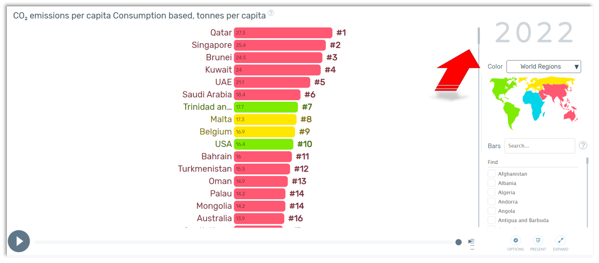
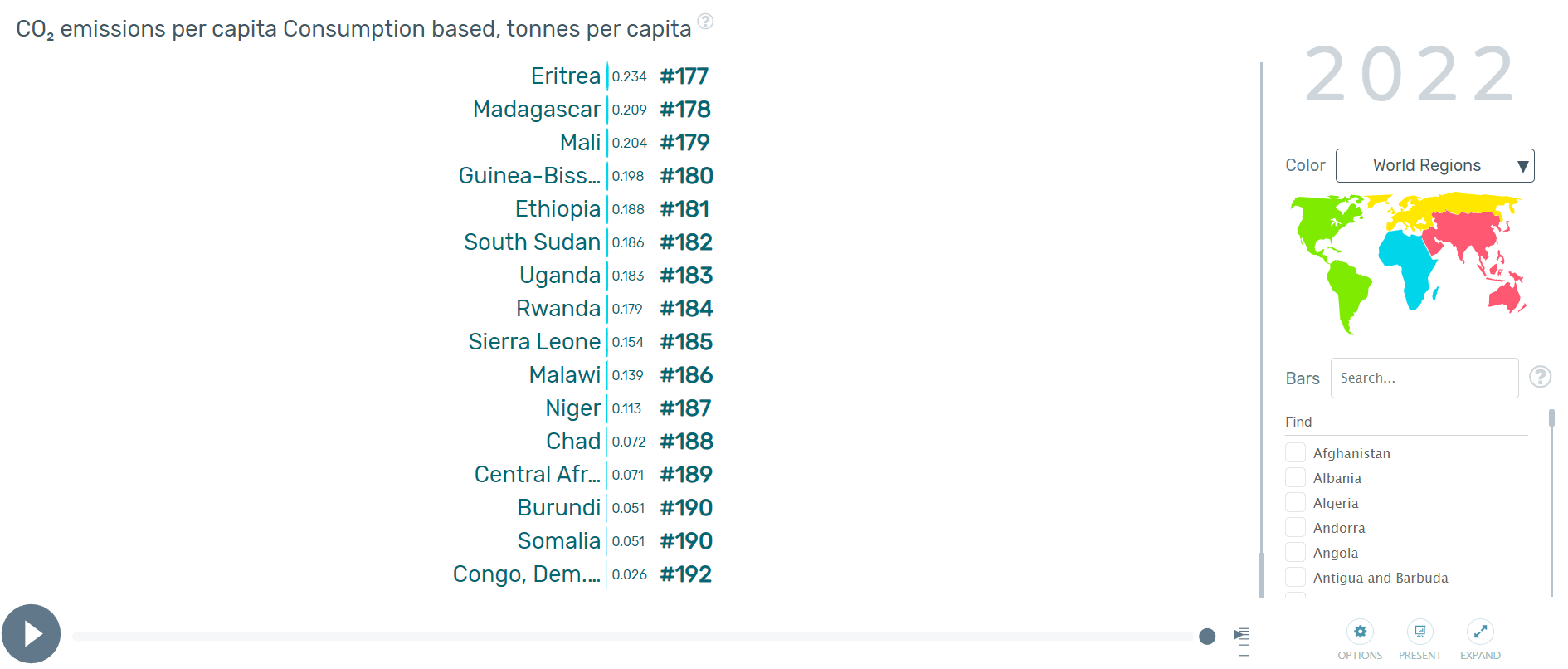
(Images adapted from https://www.gapminder.org)
With all this information at your fingertips you can easily create a box plot diagram. To do this, read the maximum and minimum values and also those values from the graph that halve and quarter the dataset.