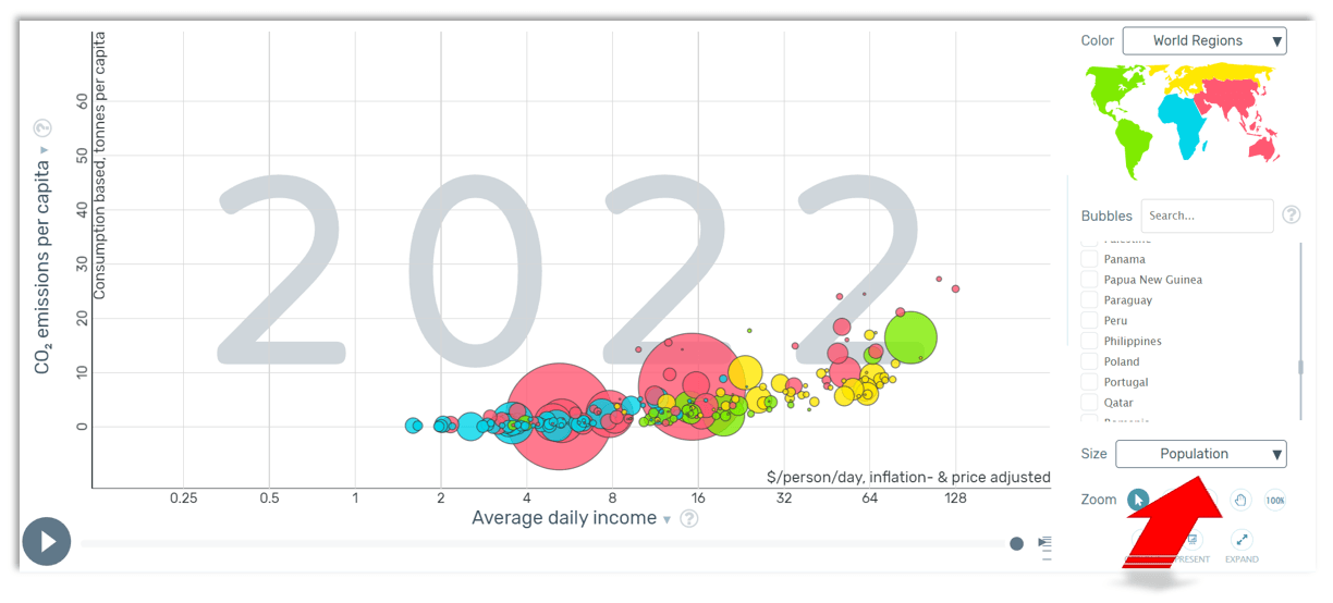
What can you find out by analysing bubble charts?
Like other graphs, the bubble chart has an x-axis and y-axis to represent two variables, and the size of the bubbles represents the third variable. The larger the bubble, the higher the value of the third variable.
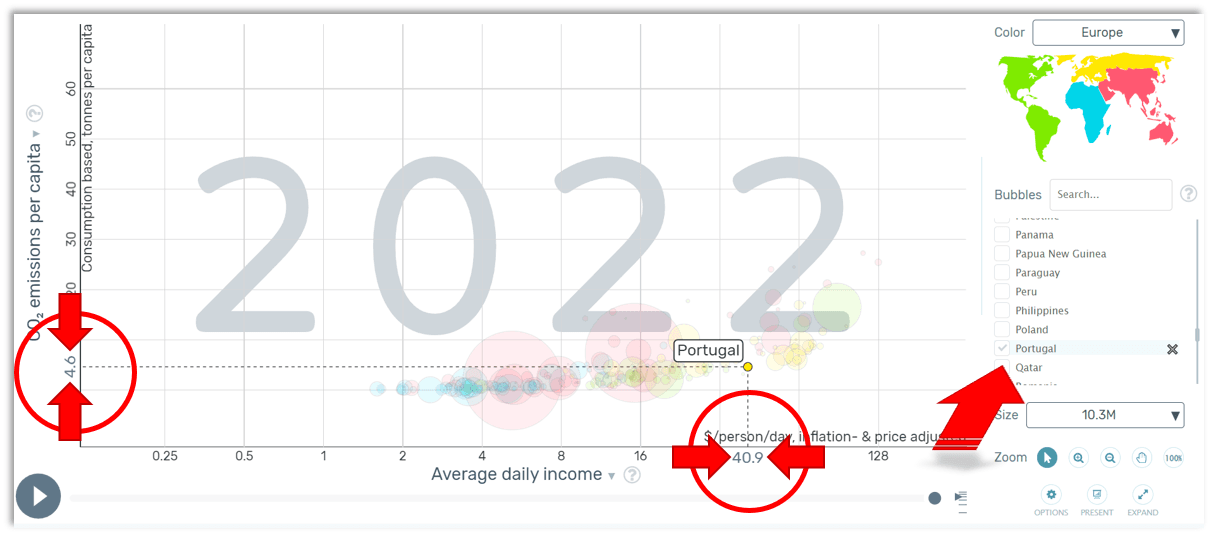
For example, if you select a specific country as the third variable, the values for the first and second variables will be displayed.
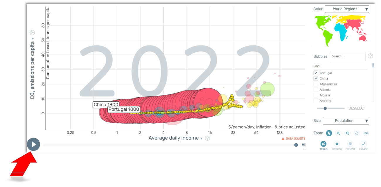
You can play the timeline to view the development of the variables over time: How have the countries developed in relation to the analysed variable?
(Images adapted from https://www.gapminder.org)