Importing and mapping point data from Excel files
Introduction
In many GIS projects, especially those related to field surveys and outdoor activities, asset tracking, or statistical reporting, spatial data comes in the form of tables or spreadsheets. These tables often contain coordinates (latitude and longitude or X/Y values) that allow us to map the data as points, lines or polygons in a GIS environment.
In this lesson, you will learn how to import an Excel file into QGIS, define which columns represent geographic coordinates, and visualize the data as point features on the map. This is a powerful way to bring real-world datasets into your spatial analysis and maps.
By the end of this lesson, you will:
✅ Learn how to properly format Excel files for spatial import in QGIS
✅ Import tables from .xlsx or .csv formats
✅ Define coordinate fields and project the data as point layers
✅ Check and adjust the Coordinate Reference System (CRS)
✅ Visualize and style point data on your QGIS map
Get ready to turn your spreadsheets into spatial insights!
Let’s suppose you’re planning an outdoor learning activity with your students, where the goal is to collect air pollution data around your school or in various parts of your city. Each student or group can use a mobile device or GPS tool to record location-based measurements, such as particulate matter (PM), CO₂ levels, or noise pollution. If you don’t have any sensors, that’s totally ok! Let the students use descriptive information, for example, about the noise levels at a scale between 0 – 200 where 0 is no noise at all and 200 is an area of loud noises, a lot of traffic jam etc.
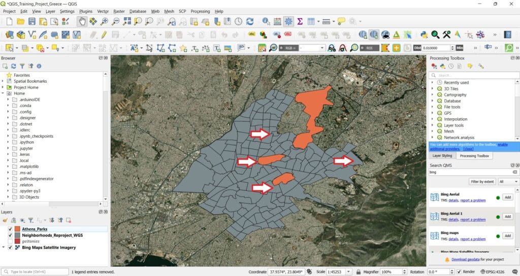
Once this data is collected in a spreadsheet—along with the corresponding coordinates—we can import it into QGIS and visualize it on a map. This not only helps students see the spatial patterns of environmental data but also strengthens their skills in data handling, mapping, and spatial thinking. Let’s load the QGIS project of our previous lesson with the data from Athens!
You may ask your students when they go back home from school, to report the noise levels in their neighborhood around 16:00 pm by righting down on a paper (or an excel file) the coordinates of their measurement and the noise level at a scale between 0 – 200. Underline that their measurements should be accurate in terms of the coordinates and the number of the decimal places. We need minimum 4 decimal places.
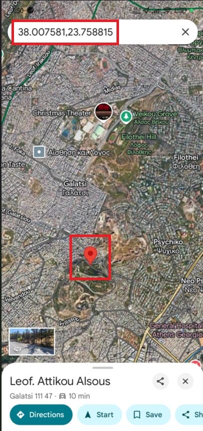
But, how the students will extract their coordinates? You may check our previous lesson ‘Platforms for data visualization’ where different applications are listed or they can just simply use ‘Google Maps’! By pressing their exact location on the map (see the image below), they can find the exact coordinates! In what CRS? Of course WGS 84 (latitude, longitude)!
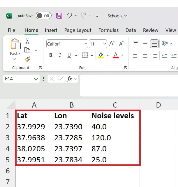
Let’s suppose that we collect the data from 4 students. Let’s write them down in an Excel file (.xlsx)! Be careful! We need a column name row (i.e. the first row). See the image below and how in Row 1 we write down the name of each column (Latitude first, Longitude second and our measurement third).
We should now save our Excel file in .csv format. This is really important because GIS platforms can ONLY READ .CSV DATA FORMATS!
![]()
After we save our noise levels measurements and the coordinates in .csv format, we can now load the data on QGIS. How? As a point shapefile!
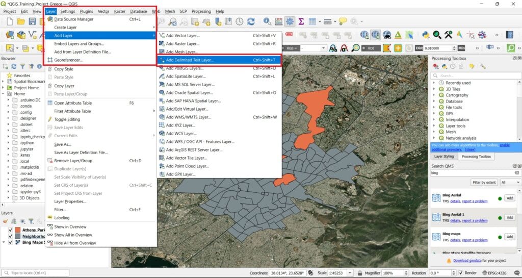
We select ‘Layers’ on the main QGIS toolbar > ‘Add Layer’ > ‘Add Delimited Text Layer’.
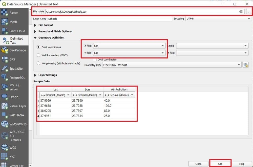
We first browse to the folder we saved the .csv file (see the image above). ‘X field’ is the Lat column, ‘Y field’ is the Lon column and in the ‘Sample Data’ window we can see if our data have been properly imported. They look ok right? Let’s press ‘Add’!

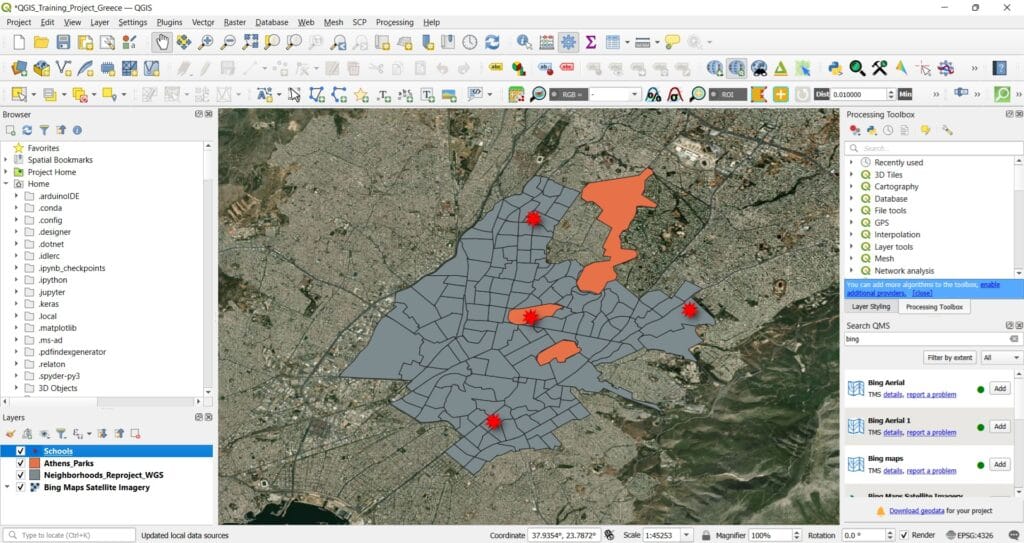
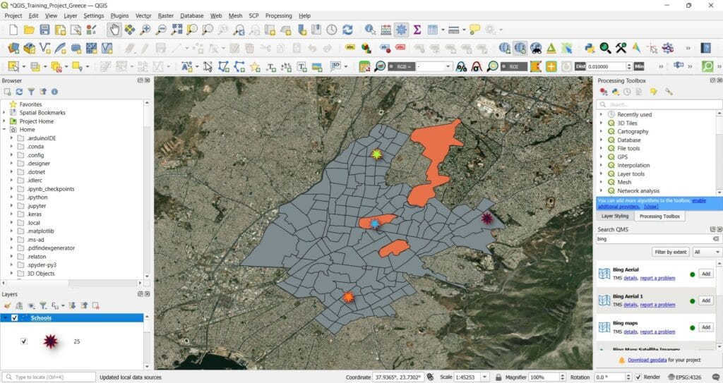
Our noise data has been added! Let’s drag the ‘Schools’ layer on the top of the ‘Layer’ list. If you only see 3 data points, that’s because our ‘Schools’ layer is hidden below the ‘Athens_Parks’ polygons!
Let’s make our data points look a bit more impressing by changing their symbol! We can double-click on the ‘Schools’ layer and change the ‘Symbology’ as can be seen on the image below.
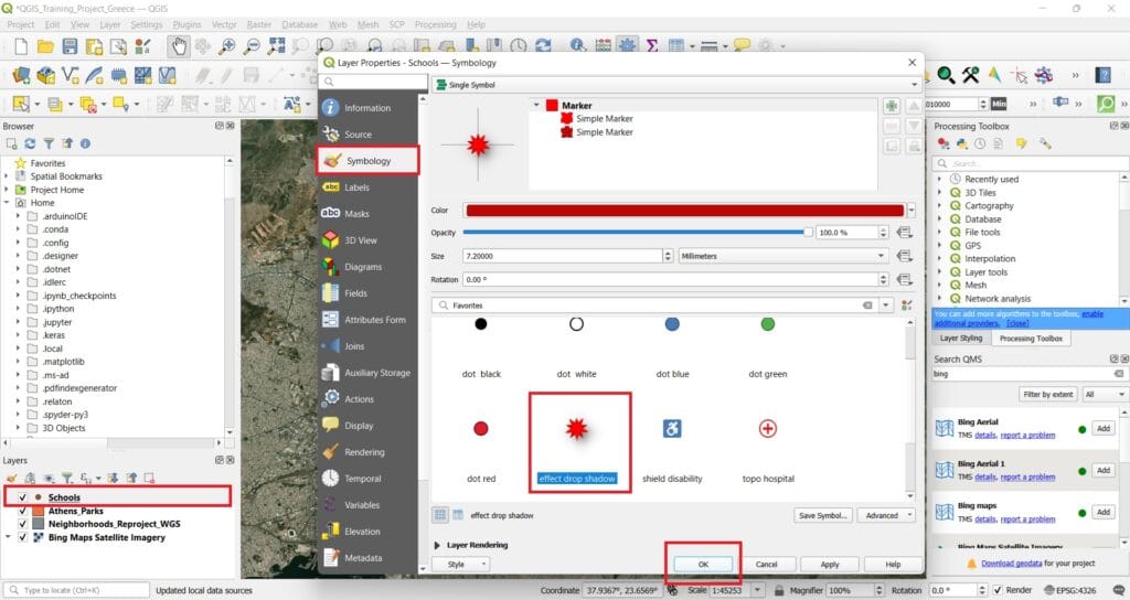
And if we press ‘OK’ the result will look like this!
However, we can make it even more impressive! Let’s double-click on the ‘Schools’ layer again and change the ‘Symbology’ style to ‘Categorized’. Then, we select the ‘Value’ field to be categorized = ‘Air Pollution’, we press the button ‘Classify’ and then ‘OK’.
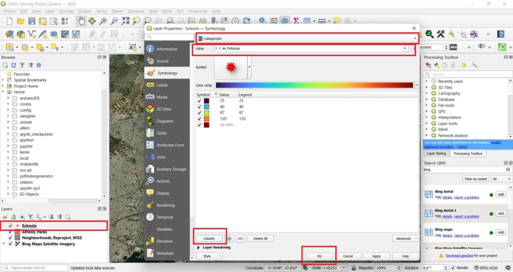
The result looks a bit more impressive! We can now see the noise levels with different colours (black colour – low noise levels, orange colour – high noise levels).
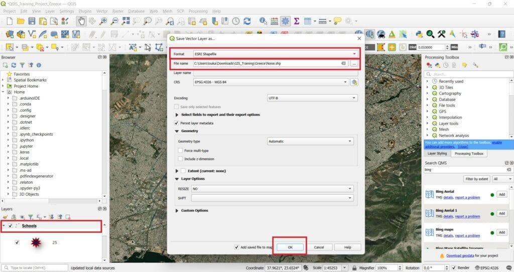
Last step, let’s save our point file data (it’s not a shapefile yet). We right-click on the ‘School’ layer > ‘Export’ > ‘Save Feature As..’. Then, we select the format we want to save our point data (what else, ‘ESRI Shapefile’ format), we select the file name and the folder to be saved and we check if the CRS is correct (EPSG:4326 – WGS 84, that’s correct).
We press ‘OK’ and that was it! Our shapefile has been saved and we can use it for other projects!
✅ Wrapping Up
You’ve now learned how to import and visualize point data from Excel files in QGIS—an essential step in bringing real-world, location-based data into your GIS projects. Whether it’s student-collected field data or public datasets, this skill lays the foundation for more advanced spatial work.
As we move forward, get ready to explore how to analyze and interpret spatial patterns using the powerful tools QGIS has to offer. In the next lessons, we’ll dive into GIS and Spatial Analysis techniques that will help you uncover trends, relationships, and insights hidden in your geographic data.
Stay curious—and get ready to take your GIS skills to the next level! 🗺️💡 Next course is focusing on GIS analysis and processing capabilities for your educational projects!