A slider reveals the past
Now we are ready to look at some really nice features of the EO browser.
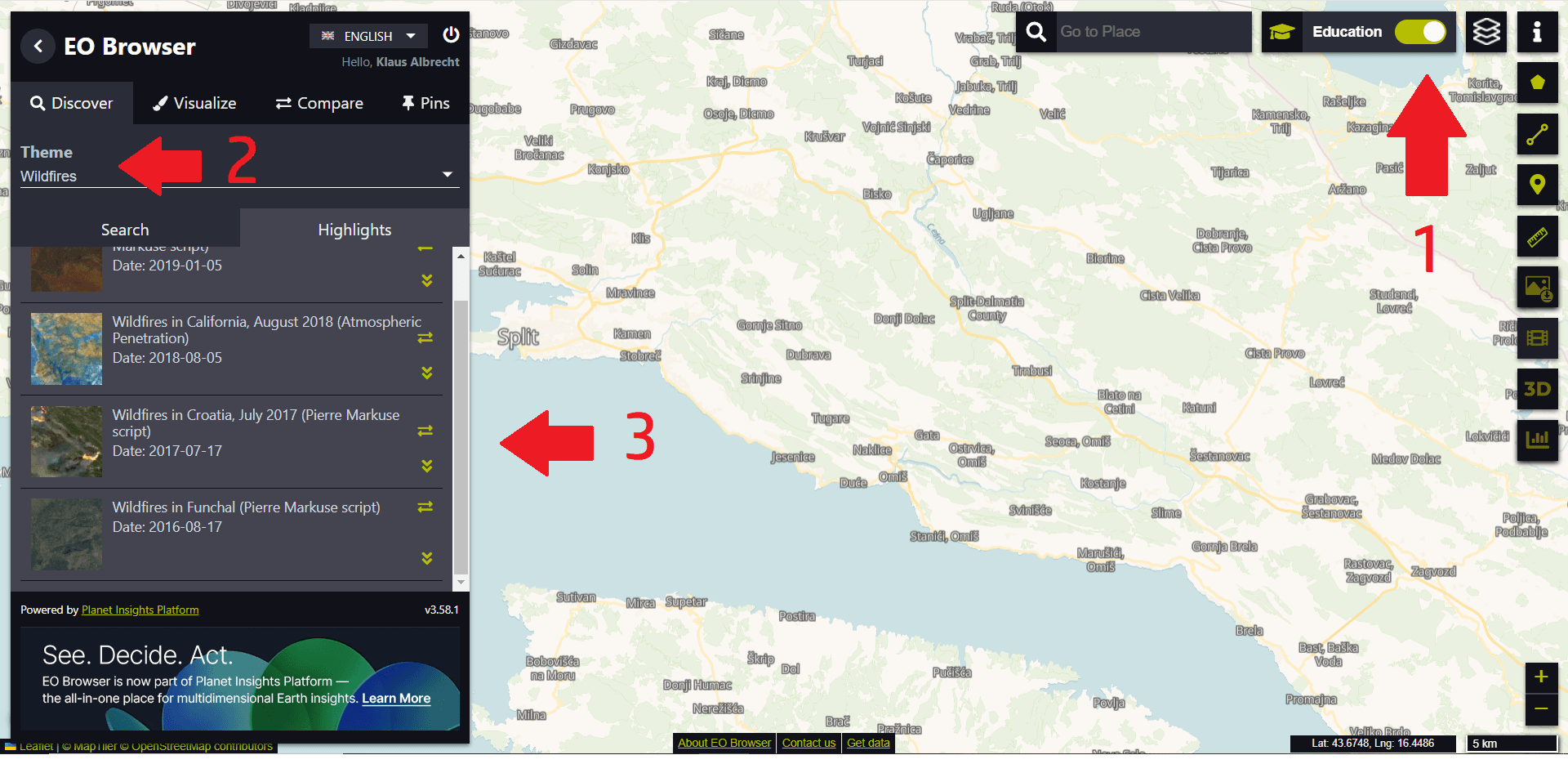
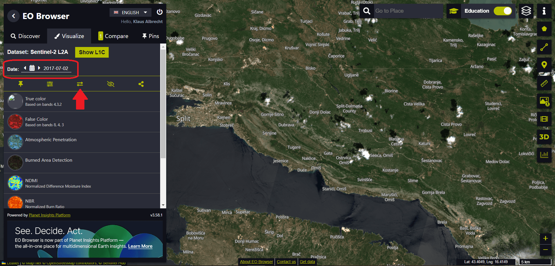
We log into the EO browser, switch to education mode (1), select the theme “Wildfires” (2) and select the fire in Croatia (3) in 2017.
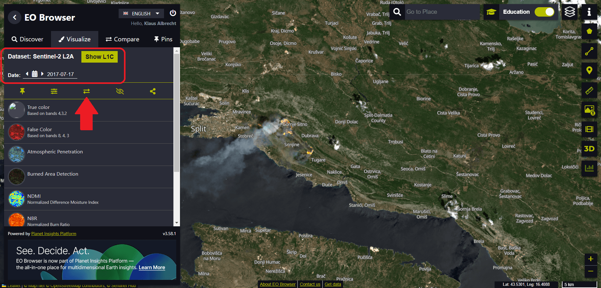
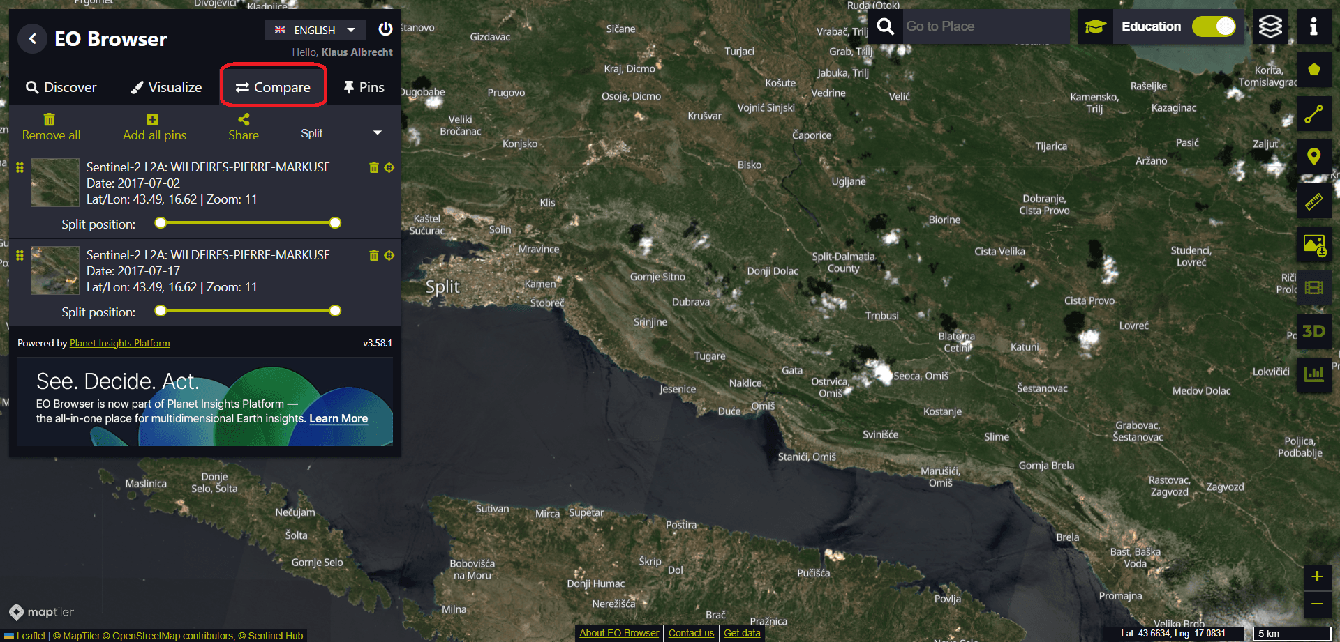
We use the Sentinel-2 data from 17 July 2017, the date of the largest fires in the region, and add these data sets for comparison by clicking on the icon with the double arrows.
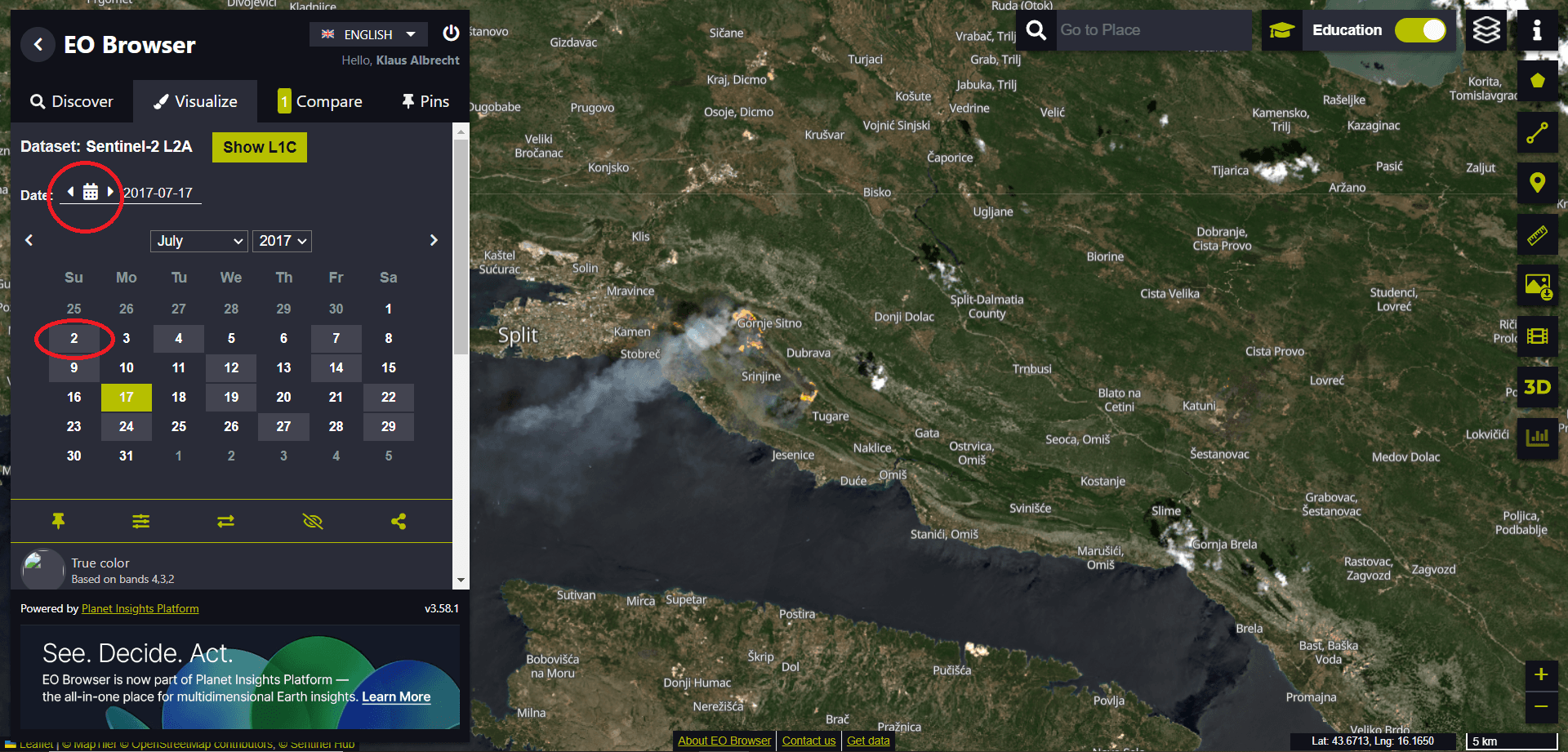
Then we open the calendar (by clicking on the calendar icon) and select a date from before the fire – let’s say 2 July 2017.
We also add this data set for comparison by clicking on the symbol with the double arrows.
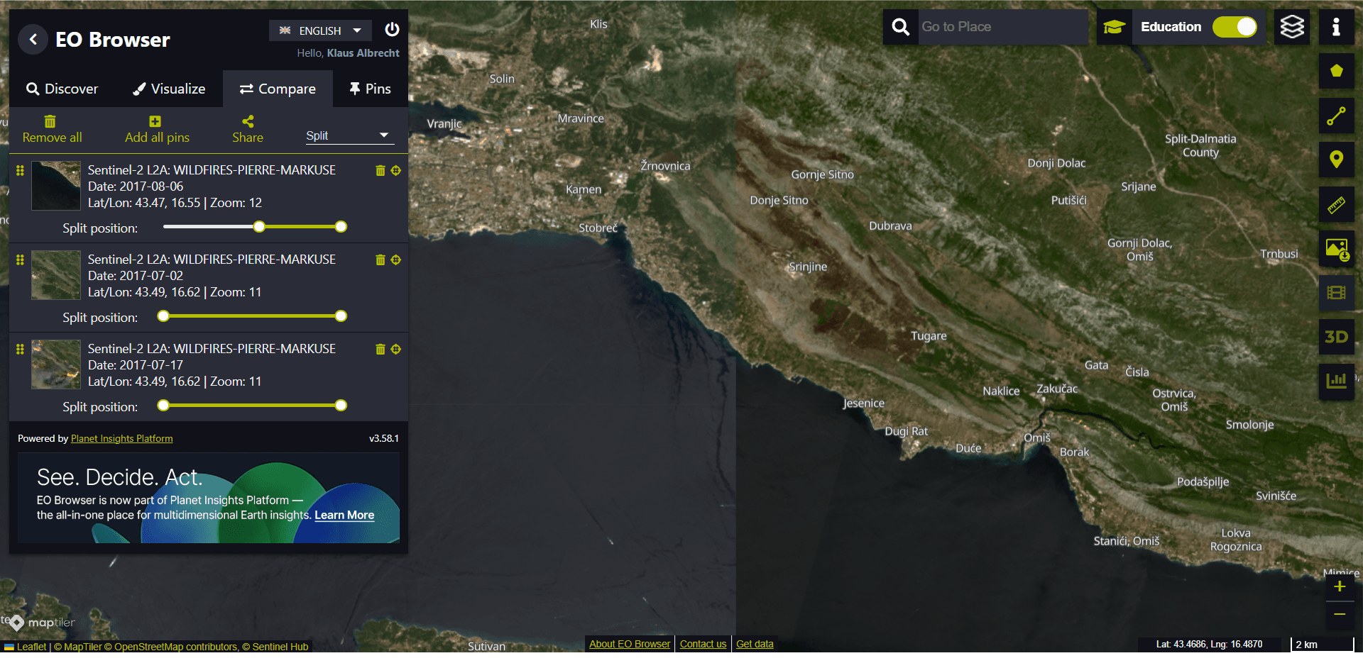
If we click on the double arrows (Compare), we can see the two data sets.
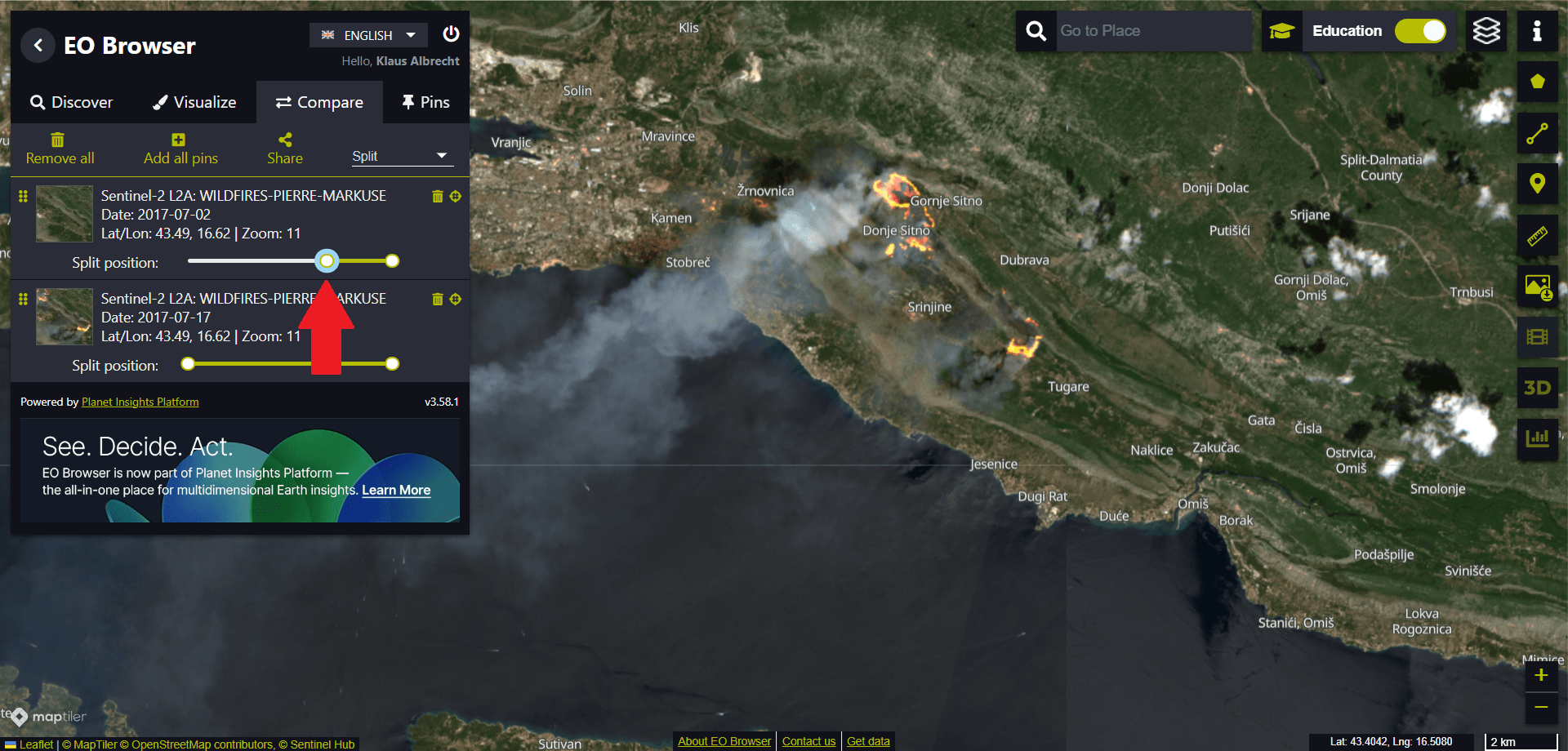
We zoom in and use the split slider to see the raging fire.
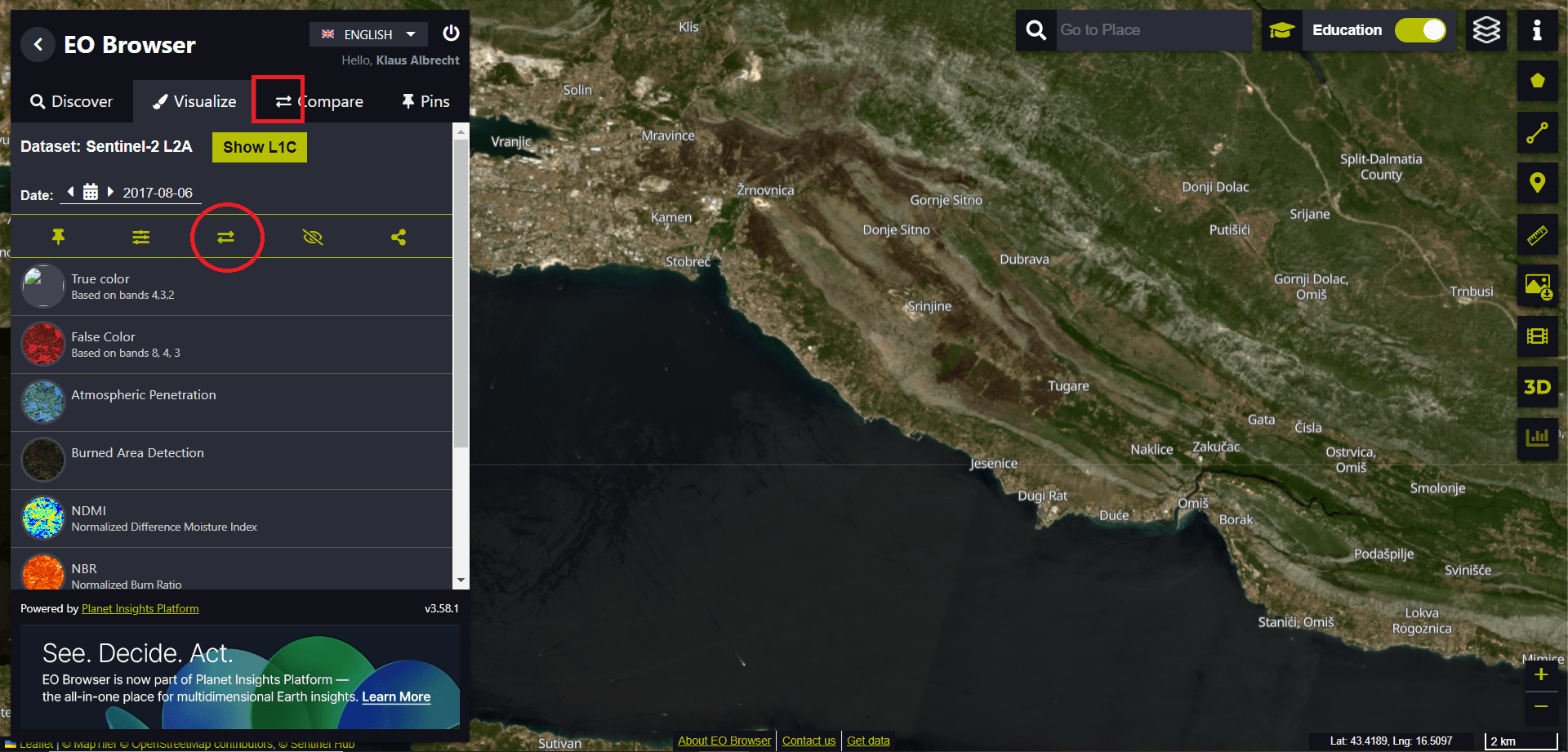
We can even add a third data set to analyse the effects of the wildfire. To do this, we click on “Visualise” (1) and select a date after the fire from the calendar (2) – let’s say 6 August 2017 (3).
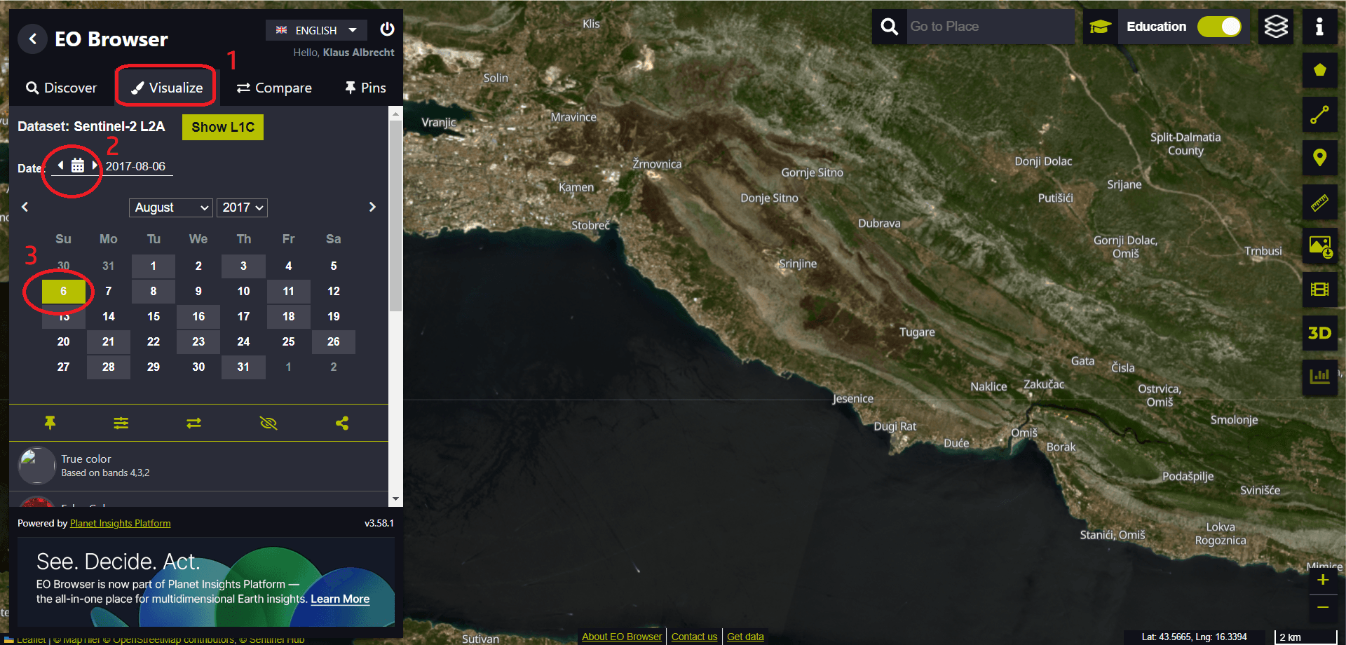
To add this data set to the comparison, click on the double arrows (marked with a red circle in the image below). Do not confuse the “Add” option with the menu of the already added data overview for the comparison (marked with a red square in the image below).
If you return to the comparison menu and change the position of the sliders, you can see how the fire has affected the region. You can also delete a data set to simplify the comparison (via the rubbish bin icon next to the data set).