Giving meaning to collaboration | RS-EO-SatApp-3.1.5
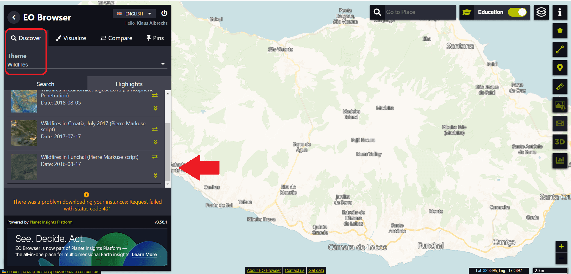
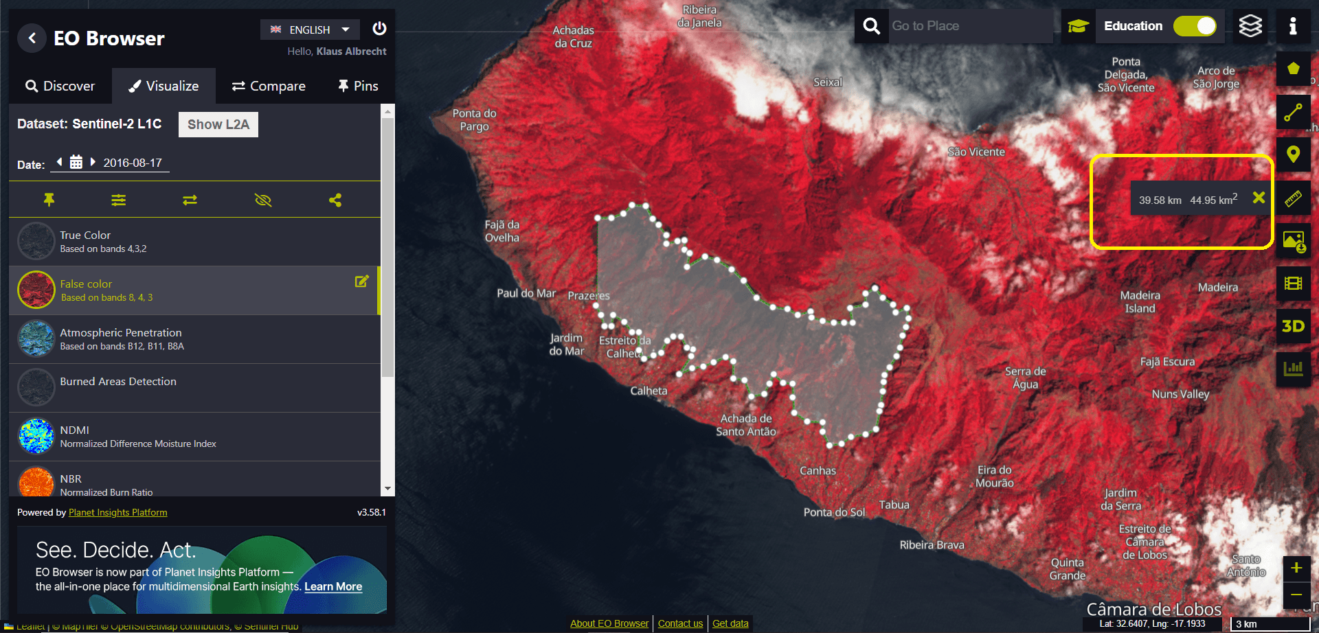
We start again with the EO browser. This time we select the data set about the fire in Madeira (“Wildfires in Funchal”) from the Theme menu.
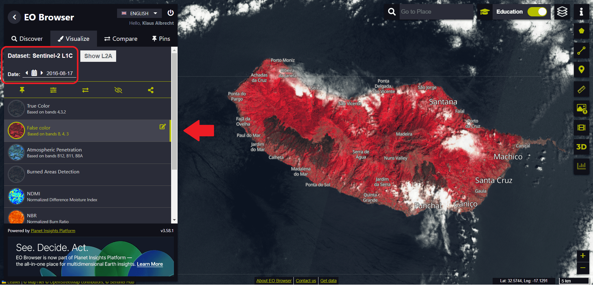
This time we visualise the Sentinel-2 dataset after a wildfire has destroyed much of the vegetation on the island. To see the effects of the fire, we use false colour rendering – using different bands in the electromagnetic spectrum to illustrate the extent of the fire.
We want to concentrate our analysis on the destroyed area west of Ribeira Brava. Using the measuring tool (toolbar on the right-hand side), we can span an area by moving the mouse and continuously tracing the desired perimeter of the area by clicking repeatedly.
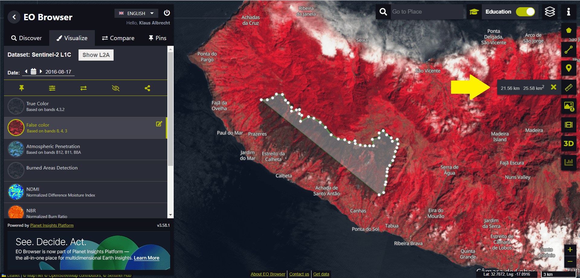
In our example, we get an area of around 45 km².
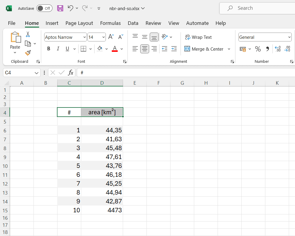
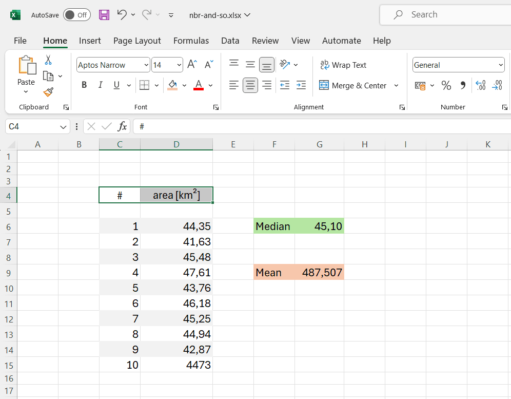
If each student in the class carries out the measurement independently, we can use all the measured data to compile simple but very reasonable statistics.
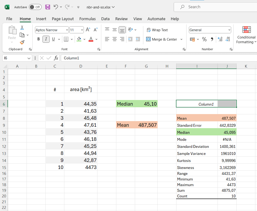
Let’s assume we have collected ten data points from ten students – with the last student (no. 10) having misplaced the decimal point. We compile the data in a spreadsheet programme, such as Microsoft Excel in this example.
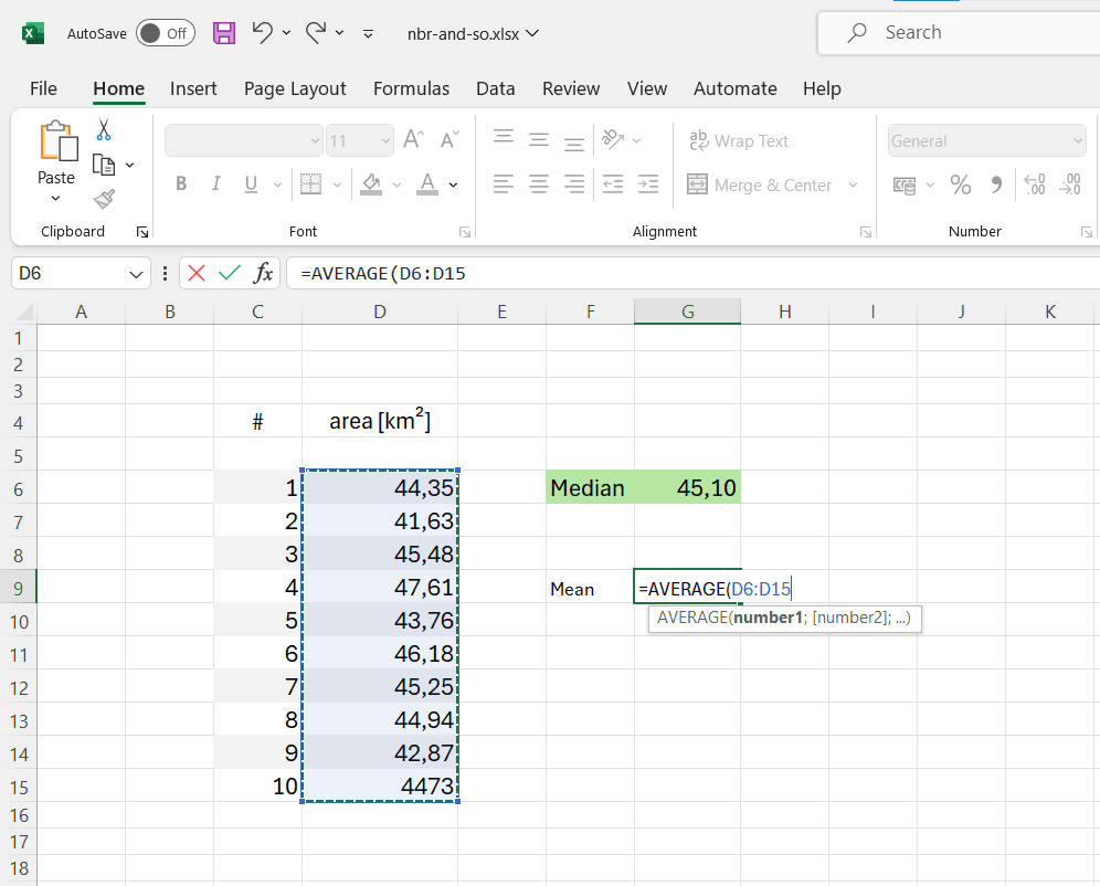
The median can be easily determined using the functions available in the programme.
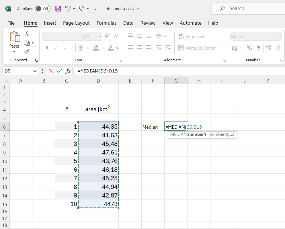
In our example, the individual data point whose decimal place is incorrect has no effect on the determination of the median. It would be different if we were to determine an arithmetic mean (average) of the data.
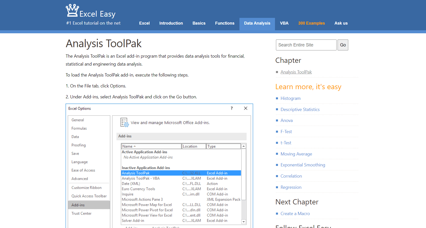
The Microsoft spreadsheet programme comes with its own “Analysis ToolPak”, which enables sophisticated data analyses. Detailed instructions for implementing the tool can be found here:
https://www.excel-easy.com/data-analysis/analysis-toolpak.html
Of course, it is still necessary to manually remove the incorrectly recorded data point before the statistics are generated.