The beauty and power of geospatial data visualizations
Watch the video on YouTube on dimensions of maps by Joseph Kerski.
See the difference of 2d and 3d geovisualizations through:
a) an emblematic map in 2D…
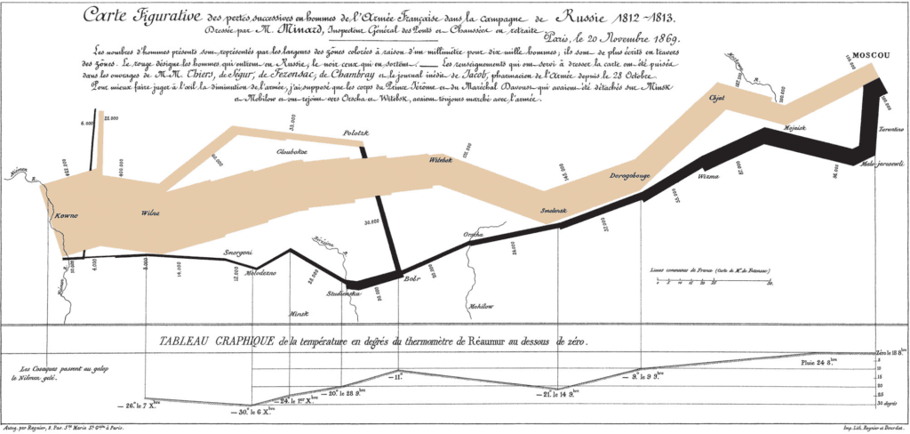
Charles Minard’s 1869 chart showing the number of men in Napoleon’s 1812 Russian campaign army, their movements, as well as the temperature they encountered on the return path. To learn more about this map/ graphic refer to this article by Frank Jacobs (2010) entitled The Minard Map – “The best statistical graphic ever drawn”.
b) and the same map as a space time cube, where the z-axis represents the months of 1812, when the campaign took place. From the article by Menno-Jan Kraak (2003), Geovisualization illustrated, ISPRS Journal of Photogrammetry and Remote Sensing, Volume 57, Issues 5–6, 2003, Pages 390-399, ISSN 0924-2716, https://doi.org/10.1016/S0924-2716(02)00167-3.
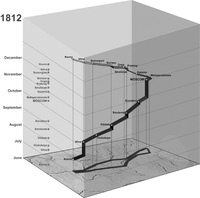
Watch also the animation of this space-time cube on YouTube.
Some different contemporary visualizations of Minard’s map can be found here.
But the differentiation between 2D and 3D is not the only interesting element of geovisualization, nor is the handling of time and temporal change.
The presentation on different Examples of Geovisualization, availabe at the course materials is indicative of the beauty, wealth, and potential of geovisualization.