Questioning and Hypothesis Building for Sonified Maps
After being introduced to the concept of map storytelling through sound, students might begin to question how numbers and locations can become music. Start this phase by guiding them to reflect on the relationship between data, geography, and emotion. Ask questions that stimulate both scientific curiosity and artistic interpretation:
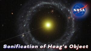
Sonification of Hoag’s Object.
This astronomical image, transformed into sound through data sonification,
illustrates how numerical and spatial patterns can be translated into auditory
experiences. It serves as a conceptual reference for students as they formulate
questions and hypotheses about representing geospatial and environmental data
through sound.
Credits: NASA / ESA / Wikimedia Commons contributors.
Sonification of Hoag’s Object (SVS14155).
Licensed under CC BY 2.0.
Original source:
https://commons.wikimedia.org/wiki/File:Sonification_of_Hoag%E2%80%99s_Object_(SVS14155).jpg
How can data values be translated into sounds?
What would a map of Europe sound like if each country’s population growth played a note?
Would environmental changes produce calm or chaotic music?
Encourage students to think about which data features might correspond best to different musical properties. For example, higher numerical values could become higher-pitched tones, while faster rhythms could represent rapid change over time. They should also consider how spatial data might be layered: could latitude or longitude define pitch, while the intensity of a phenomenon determines volume or duration?
Next, organize students into small groups and invite each to choose a dataset that tells a meaningful story about society or the environment — for instance, changes in CO₂ emissions, access to clean water, or biodiversity loss across regions. Reliable open sources include the Eurostat database and the European Data Portal
Each group should then propose a research question related to their chosen dataset, such as:
– How can we represent population density differences across Europe using sound?
– Can we transform air quality variations into a musical pattern that helps people “hear” pollution levels?
– How can we make data about renewable energy adoption more engaging through sonification?
Based on their question, students should formulate one or more hypotheses to guide their creative and analytical process. Examples include:
– “If we assign higher pitch to larger numerical values, regions with higher population or pollution will sound sharper.”
– “Slow, low-frequency tones will better represent stable conditions, while rapid changes will produce more complex and dissonant rhythms.”
– “Hearing data through sound will make it easier to perceive gradual trends that are harder to notice in visual charts.”
All hypotheses should be recorded in a learning log or inquiry notebook before experimentation begins. Encourage students to visualize how their data might “sound” even before coding it. Later, during the experimentation and analysis phase, they will compare these expectations with the real outcomes of their sonified maps. This process not only promotes data literacy and computational thinking, but also strengthens their ability to express scientific information through creative, multisensory storytelling.