Experiment: Creating Sonified Maps Using Open Data
To test their hypotheses, students will create their own map-based sonification project by collecting georeferenced statistical data and transforming it into sound using digital tools. This process combines coding, data analysis, and artistic creativity, offering an interdisciplinary experience where geography meets music and technology.
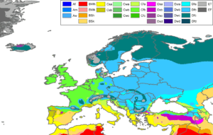
Köppen–Geiger Climate Classification Map of Europe.
This map illustrates spatial environmental patterns across Europe, offering
students a concrete example of open geospatial data that can be transformed
into sound through sonification techniques.
Credits: Peel, M. C.; Finlayson, B. L.; McMahon, T. A.
Licensed under CC BY-SA 3.0.
Original source:
https://commons.wikimedia.org/wiki/File:Europe_Koppen_Map.png
Instructions for creating a sonified map using geospatial data:
Students should begin by selecting a dataset related to a real-world phenomenon — such as climate data, demographic growth, or renewable energy adoption — from reliable open sources like the Eurostat database, World Bank Data or Copernicus Climate Data Store
The dataset should include location-based values (e.g., per country, region, or year) that can be translated into sound.
Next, students will import or manually input their dataset into a sonification tool. Several platforms can be used, such as:
– TwoTone a free web application that converts CSV data into sound and music;
– Sonic Pi , a programming environment for live coding music;
– Google Earth Engine combined with p5.js Sound Library, for advanced integration of spatial and auditory representation.
Students will assign different data attributes to sound properties: pitch, rhythm, volume, or instrument type. For example, population could correspond to pitch, CO₂ emissions to tempo, and life expectancy to volume. Encourage experimentation by mapping one variable per sound layer, creating a “soundscape” that evolves as the data changes across regions or years.
Data should be tested and analyzed under different conditions — for instance:
– comparing two countries or regions across several years;
– testing how increasing or decreasing data intervals affect the musical structure;
– exploring how different musical mappings (e.g., high values = loud vs. high values = soft) change interpretation.
During the activity, students should document each test in their inquiry log, noting how their choices influenced the final sound. For example, a group may discover that mapping rapid data changes to rhythm better expresses variability than using pitch alone. Another might observe that combining environmental and social indicators produces more complex and meaningful compositions.
Encourage students to reflect and revise their hypotheses as they listen to the resulting sonifications. Did the data sound as they expected? Did certain variables produce more noticeable or expressive changes? What patterns emerged from hearing the data instead of seeing it? Through discussion and comparison, students will develop a deeper understanding of how different representation modes — visual and auditory — complement each other in data interpretation.
All results and reflections should be recorded, including exported sound files, screenshots of their digital tools, and any graphs used for comparison. The complete process — from dataset selection to sound generation and interpretation — should be documented systematically, emphasizing both scientific accuracy and creative exploration.
By the end of this stage, students will have composed their own “data music”, demonstrating how the fusion of science, art, and technology can offer fresh perspectives on how we perceive the world. They will also recognize that sonification is not just an artistic experiment, but a powerful method of inquiry, allowing new forms of understanding and communication about global phenomena that shape our collective future.