Network analysis
🚦 Introduction to Network Analysis in QGIS
In this lesson, we turn our attention to one of the most practical and exciting applications of GIS: Network Analysis. Whether it’s finding the shortest route from point A to point B or simulating access to resources, network analysis allows us to model and solve real-world movement and accessibility problems.
Route finding is one of the most common problems in spatial modelling and geosciences overall. Optimal route planning, distribution networks and navigation are some aspects that are covered in our daily life based on optimal pathfinding algorithms.
Using OpenStreetMap (OSM) data, we will simulate routing operations, just like a GPS! You’ll explore how Least Cost Path algorithms help calculate the most efficient travel paths based on distance, time, or other constraints. This kind of analysis is especially valuable in fields such as urban planning, transportation, logistics, emergency response, and environmental management, and it’s a great way to engage students with real-world, problem-solving tasks.
By the end of this lesson, you will:
✅ Understand the concept of network analysis and how it applies to GIS
✅ Learn how to download and use OpenStreetMap data for road networks
✅ Simulate basic routing and service areas operations—just like a GPS system
✅ Use these tools to support spatial reasoning and classroom projects related to mobility, planning, or access
Let’s get started and explore how geography meets navigation—right from your classroom! 🛣️📍🗺️
🧭 Understanding Network Analysis in GIS: Finding the Shortest Path
Network analysis in Geographic Information Systems (GIS) is a powerful tool that models and analyzes the movement through interconnected systems, such as road networks, utility lines, or pedestrian pathways. One of the most common applications is determining the shortest or fastest route between two or more points.
At its core, network analysis treats the network as a graph composed of nodes (e.g., intersections) and edges (e.g., road segments), each with associated attributes like distance, travel time, or cost. To find the optimal path, algorithms evaluate these attributes to minimize the total cost from a starting point to a destination. A widely used algorithm for this purpose is Dijkstra’s algorithm, which systematically explores paths, always selecting the route with the lowest cumulative cost until the destination is reached. Dijkstra’s shortest path algorithm was invented in 1956 by the Dutch computer scientist Edsger W. Dijkstra during a twenty minutes coffee break, while out shopping with his fiancée in Amsterdam. The reason for inventing the algorithm was to test a new computer called ARMAC [1].
A great explanation on how the algorithm works can be found in the W3Schools website. To find the shortest path, Dijkstra’s algorithm needs to know which vertex is the source, it needs a way to mark vertices as visited, and it needs an overview of the current shortest distance to each vertex as it works its way through the graph, updating these distances when a shorter distance is found.
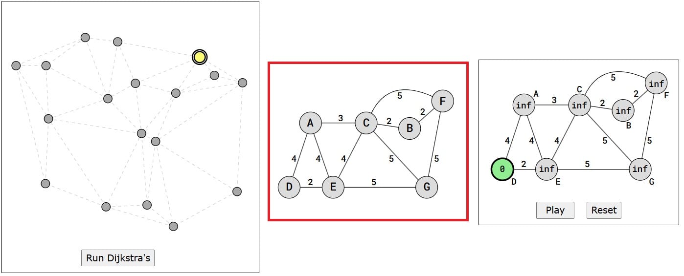
Image source: W3Schools
How it works (see the image above):
- Set initial distances for all vertices: 0 for the source vertex, and infinity for all the other.
- Choose the unvisited vertex with the shortest distance from the start to be the current vertex. So the algorithm will always start with the source as the current vertex.
- For each of the current vertex’s unvisited neighbor vertices, calculate the distance from the source and update the distance if the new, calculated, distance is lower.
- We are now done with the current vertex, so we mark it as visited. A visited vertex is not checked again.
- Go back to step 2 to choose a new current vertex, and keep repeating these steps until all vertices are visited.
- In the end we are left with the shortest path from the source vertex to every other vertex in the graph.
🗺️ Least Cost Path (LCP) Analysis
Another approach in network analysis and pathfinding implementations is the Least Cost Path analysis (LCP) which is a GIS technique used to determine the most efficient route between two points across a landscape, considering various factors that contribute to “cost” where “cost” refers to any impedance to movement, such as the 2D or 3D distance, steep slopes, land cover types, or other environmental factors.
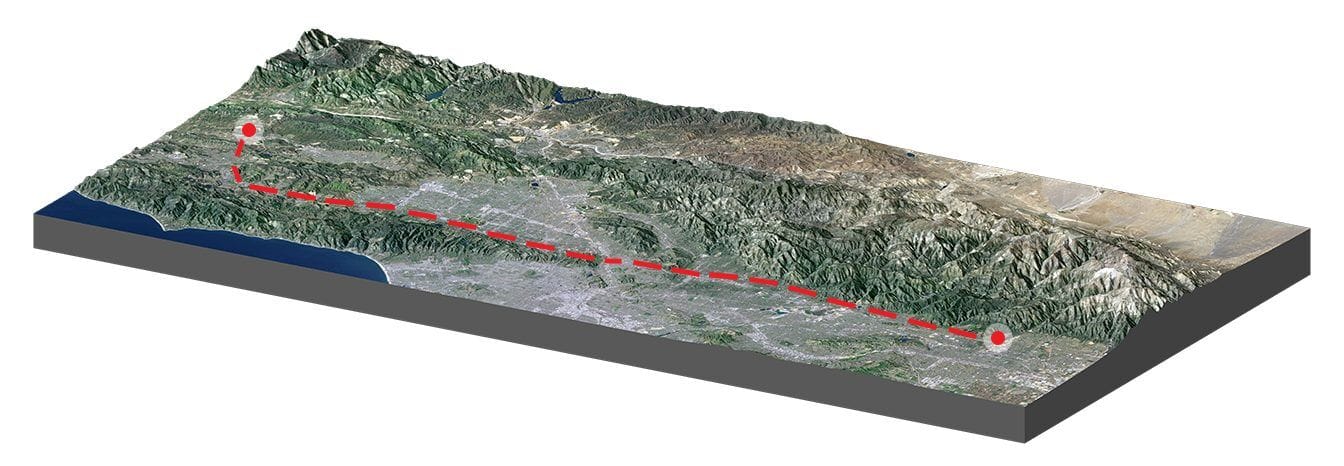
Image source: GIS Geography – Least Cost Path Analysis in GIS
This analysis is very practical in linear infrastructure and routing applications. For example, pipeline, powerline, and trail planning heavily rely on this type of analysis for route selection. When finding the least cost path, you would typically compare the costs of different paths and choose the one with the lowest cost. This could be in terms of time, money, or any other metric [4].
How LCP Works:
- Cost Surface Creation: A raster layer is developed where each cell represents the cost of traversing that area. For instance, areas with steep slopes or dense vegetation might have higher costs.
- Cost Distance Calculation: From a starting point to an end point, the cumulative cost to reach every other cell is calculated, resulting in a cost distance raster.
- Backlink Raster Generation: This raster records the direction from each cell back to the neighboring cell that offers the least cumulative cost, effectively mapping the path of least resistance.
- Path Delineation: Using the cost distance and backlink rasters, the optimal path (i.e. based on Dijkstra implementation) from the destination back to the source is traced, ensuring the route accumulates the least total cost.
In the following image you can see an indicative example of LCP implementation that you may test with your students:
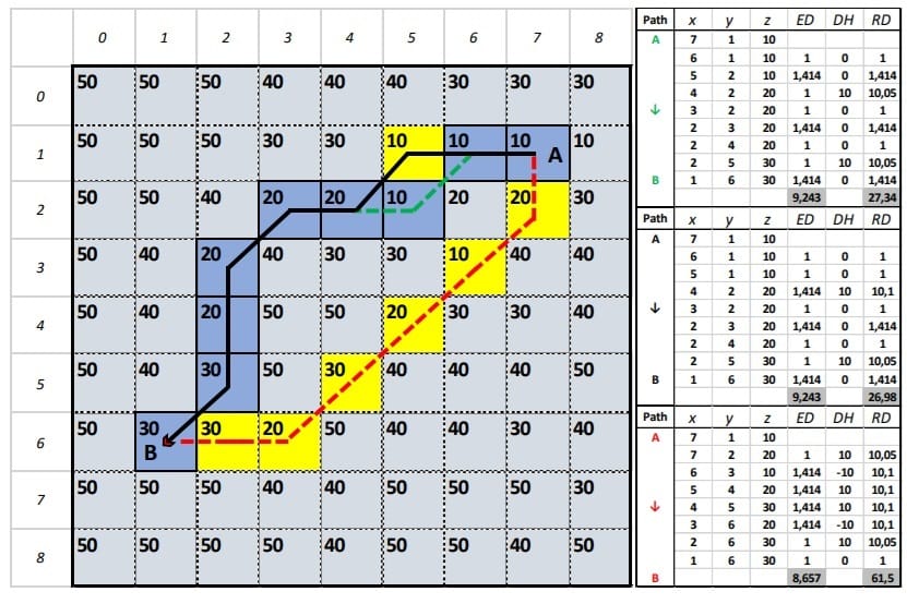
Using this specific example and considering that the moving distance from one cell to another in the cross directions(up, down, left, right) is 1, estimate the diagonal distance along with the 3D distances from A to B (black, green and red paths). ED: Euclidean distance, DH: Height difference, RD: Real distance on the ground which is the shortest distance considering only the 2-dimensional space (from one cell to another)? To the contrary, if we also consider slopes (3-dimensional space), which is the shortest path and why?
When evaluating the paths from point A to point B of the image above, it is observed that the northern paths (represented by black and green lines) have a length of 9 units (pixels) and a horizontal distance (HD) of 9.243 units, while the southern path (depicted in red) measures 8 units with a distance of 8.667 units. When considering only the HD, the optimal path appears to be the red one. Nevertheless, in terms of crossing through pixels lower slopes, the path represented by the continuous black line, which has a real 3D distance (RD value of 26.98, is the optimal choice compared to a value of 27.34 and 61.5 for the green and the red path, respectively. This discrepancy arises because although the total lengths of the green and black paths are equivalent, the slope variations between the pixels differ.
🛠️ Implementing Network Analysis in GIS Software
Modern GIS platforms, such as QGIS and ArcGIS, offer tools to perform network analysis [2,3]:
- Shortest Path (Point to Point): Calculates the most efficient route between two manually selected points on the map.
- Service Area Analysis: Determines the area reachable within a certain distance or time from a specific location, useful for accessibility studies.
- Routing: Finds the best path through a network, considering various constraints and preferences.
These tools require a network dataset (i.e. from OSM), which includes the spatial representation of the network and the necessary attributes for analysis.
Let’s try it with the QGIS platform! This time we ‘travel’ to Sofia, Bulgaria!
Step 1: We will need network data to test the algorithms so, let’s try BBike platform.
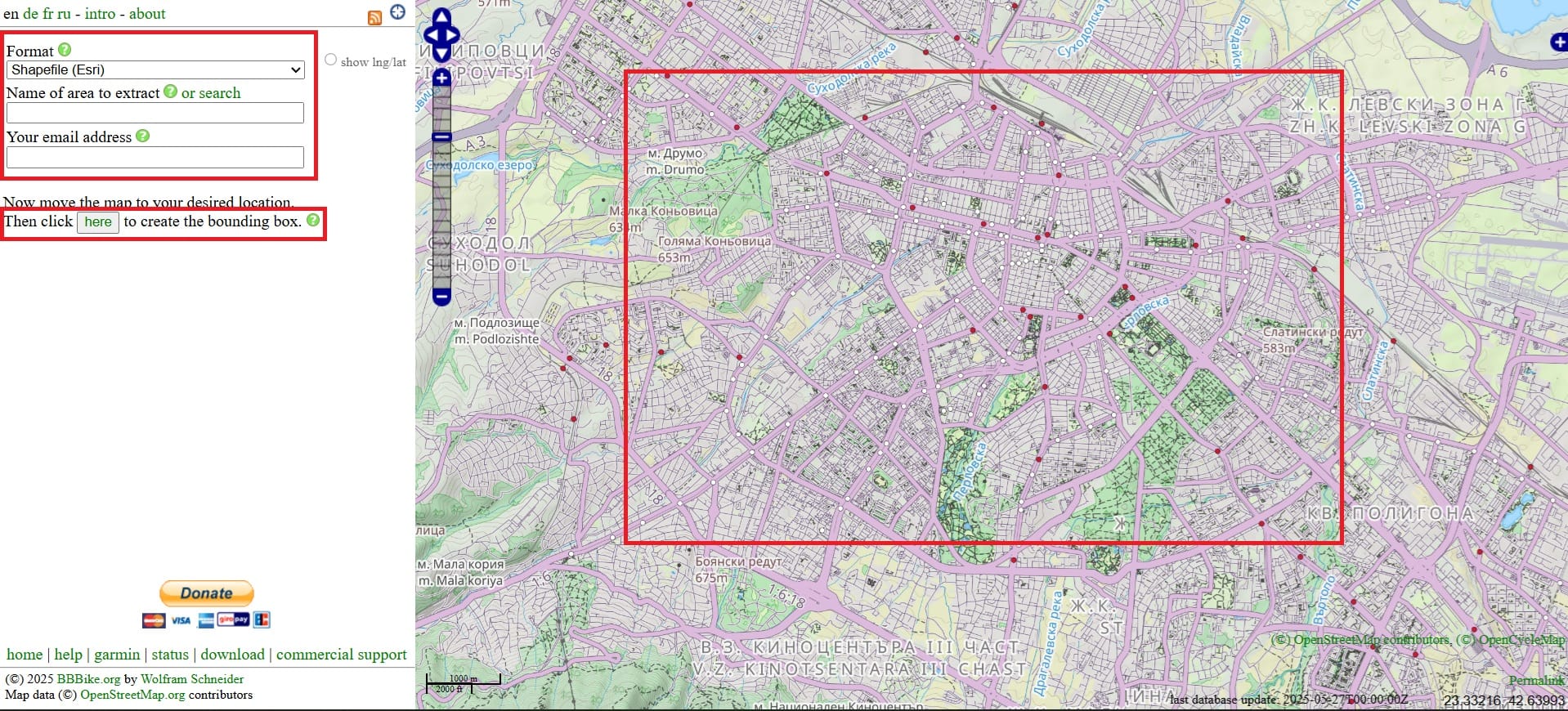
We zoom-in in Sofia city, Bulgaria > we give a name to the area we want to doanload > our email address and > we click ‘here’ to draw a rectangle of the area.
Then, we select ‘Extract’ and within a couple of minutes we will receive an email with the download link. We will also download the Administrative units of Bulgaria (it’s not needed for the analysis) as an overlay layer. Now that you are experts, you may use the GeoBoundaries website and download ‘ADM0’ for Bulgaria.
Step 2: We open QGIS and we load our shapefiles and OSM Basemap
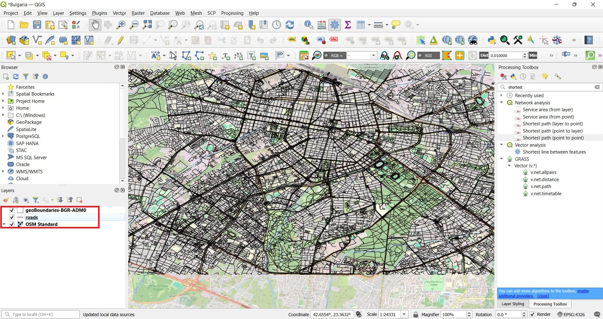
We load the ‘road.shp’ data, the ‘geoBoundaries-BGR-ADM0’ and the ‘OSM Basemap’ in QGIS and we save our new project as ‘Bulgaria’ in the ‘GIS_Training’ folder.
Step 3: Reproject our data from WGS 84 to a projected CRS for Bulgaria
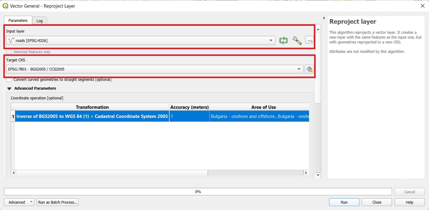
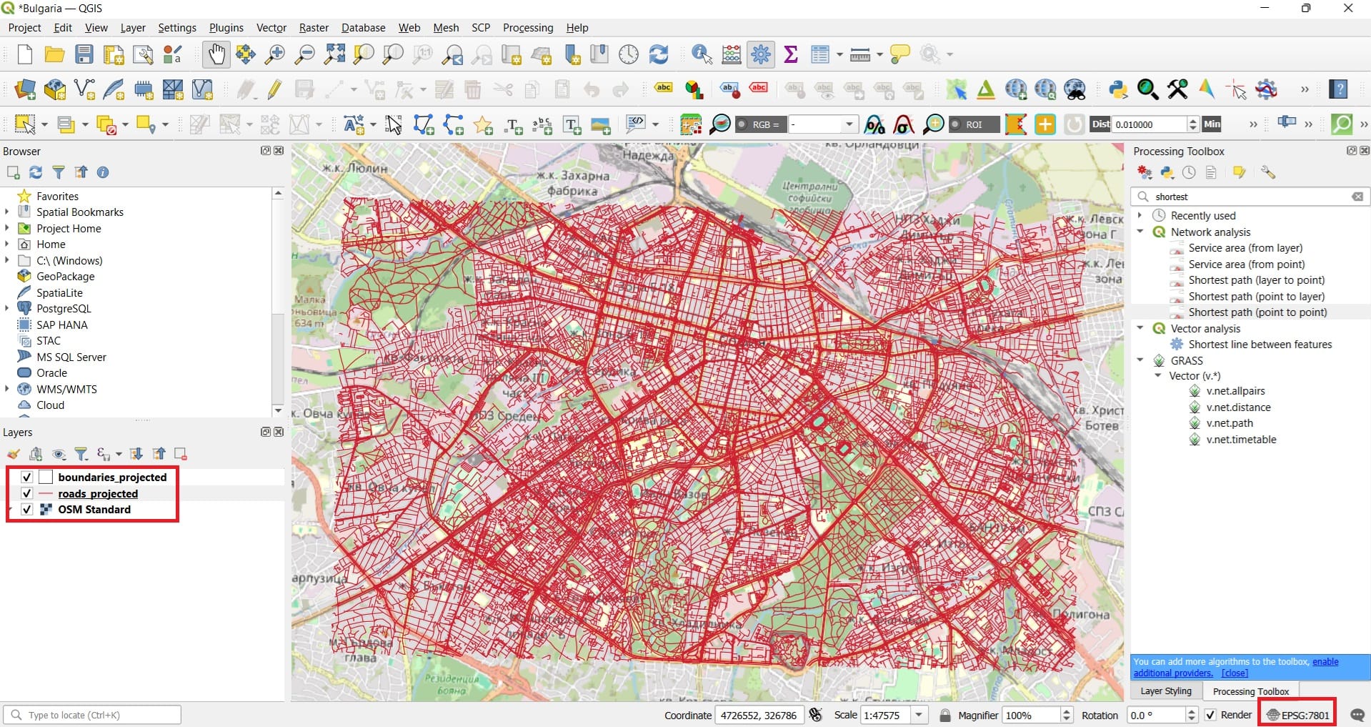
We select ‘Vector’ > ‘Data Managment Tools’ > ‘Reproject Layer’ and we name our new file as ‘roads_projected’. We repeat for the boundaries layer and we save as ‘boundaries_projected’.
We also change the CRS of the project to EPSG: 7801 and that was it! We are now ready to test some routeing scenarios in Sofia!
Step 4: Run the network analysis
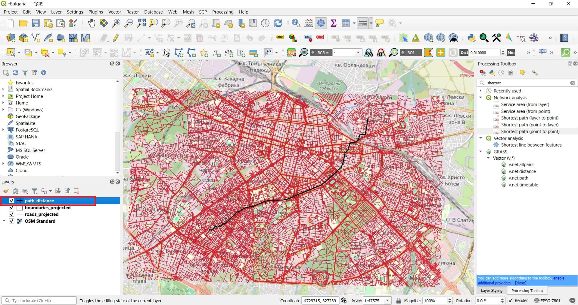
Now that our data are in the correct form, we type in the Processing Toolbox tab ‘Shortest’
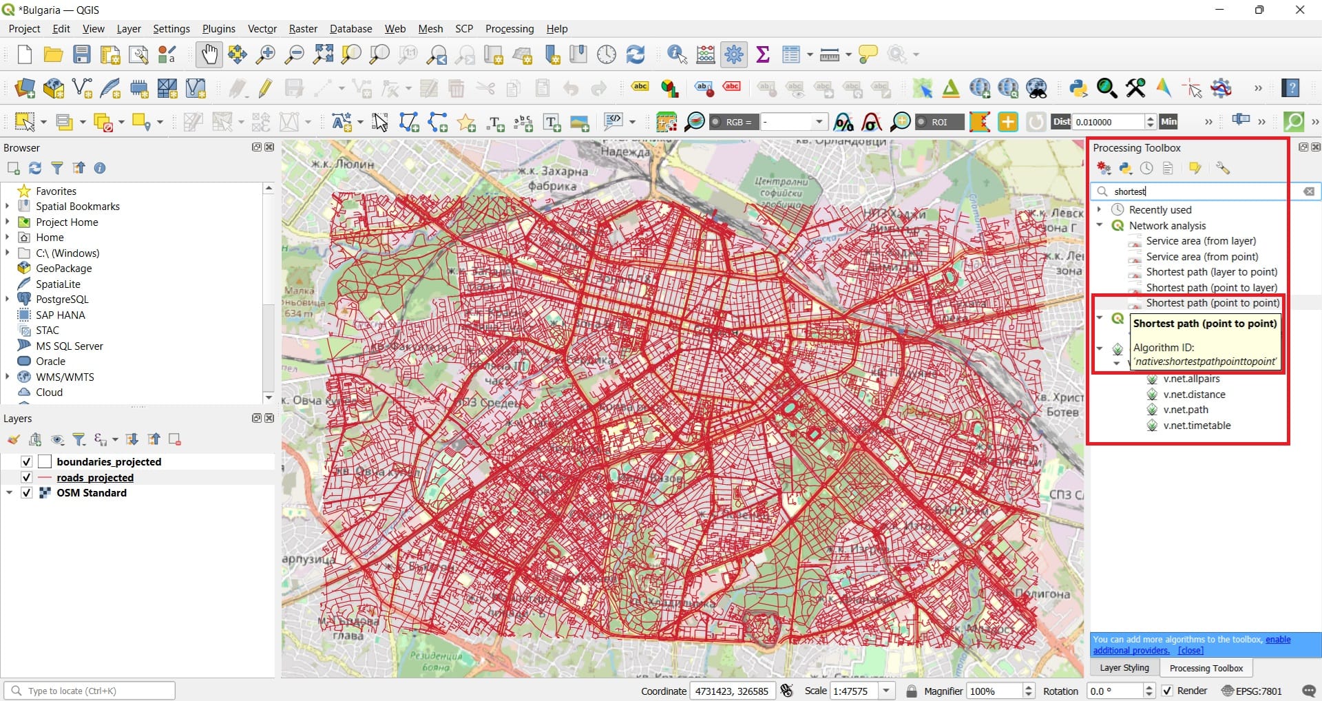
In the ‘Shortest Path’ tool we select:
- Vector layer: roads_projected
- Path type: Shortest
- Start point and End point, just press on the 3 dots and click on the map your starting and end points (COPY THE COORDINATES AND THE EPSG INFORMATION TO A TXT FILE)
- Save feature as: path_distance
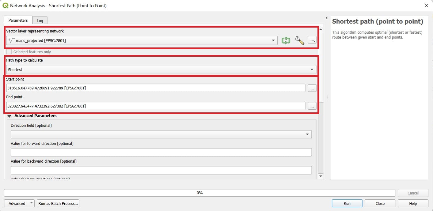
Let’s check the result! We may change the ‘Symbology’ of our path by double-clicking on the new layer. Aslo, if we open the ‘Attribute Table’, we will see that the cost of our optimal route is ‘7435’ (the route we selected in this exercise) which reflects the actual distance in kilometers.
Let’s try another scenario! This time, we will try to be more realistic while setting up the ‘Shortest Path’ tool. Before we run the second scenario, we need to process a little bit more our ‘roads_projected’ shapefile!
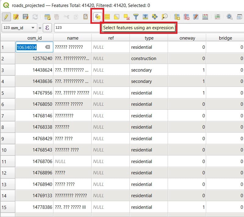
To do that, we right-click on it (Layers tab) and we open the ‘Attribute Table’! When you open the ‘Attribute Table’, you may see that the last column includes the maximum speed per road segment. However, some values are ‘NULL’ which means that either no information is available or this segment has no speed limitation (that’s almost impossible inside the city center).
For our second scenario, we will also set-up the maximum speed information and if a road segment is oneway or not. To do that, we must fill-in all information needed on the ‘max_speed’ column because NULL values will make the calculations impossible. Let’s try to select all segments with a NULL maximum speed value.
First we open the ‘Attribute Table’ and we press the ‘Select features using an expression’ (see the image below).
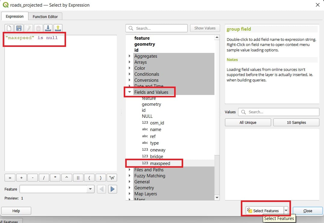
A new window will appear in which we can type our query for selecting specific features (lines) meeting a specific condition. This condition is expressed as:
”maxspeed” is null and in order to be sure that we type it properly > we double-click under the ‘Fields and Values’ the ‘maxspeed’ column and then we type on the left panel ‘is null’ like is shown on the image below.
Next, we press ‘Select Features’
After you press ‘Select Features’, you will see that all segment with a ‘maxspeed’ value = NULL have been marked/selected.
Now we press ‘Open Field Calculator’ in order to assign a random ‘maxspeed’ value on the NULL cells.
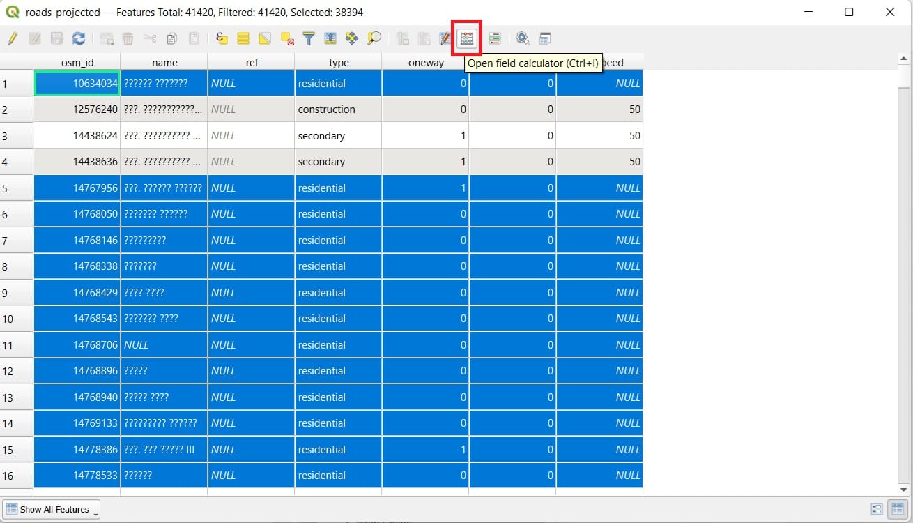
In the ‘Field Calculator’ window, we select:
- Only update XXXXX selected features
- Update existing field
- Right below the ‘Update existing field’ > select ‘maxspeed’
- Type in the ‘Expression’ window the number 40 (km/h)
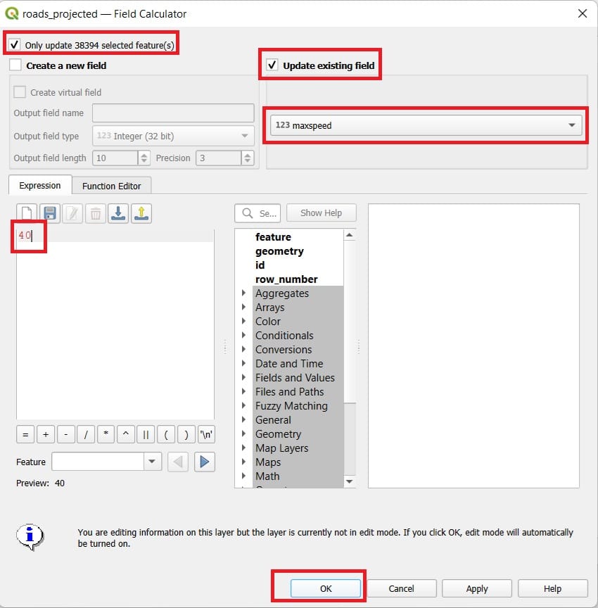
- Press ‘OK’
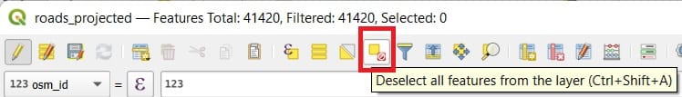
That was it! As you can see, the NULL values disappeared and now, we have a maximum speed limit for all these road segments of 40 km/h. We click on the ‘Deselect all features from layer’ in the ‘Attribute Table’ (see the image below) and we close it.
Now we are ready to run our second scenario!
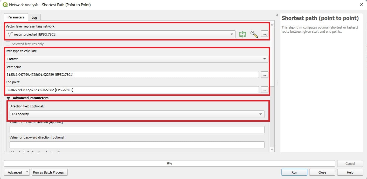
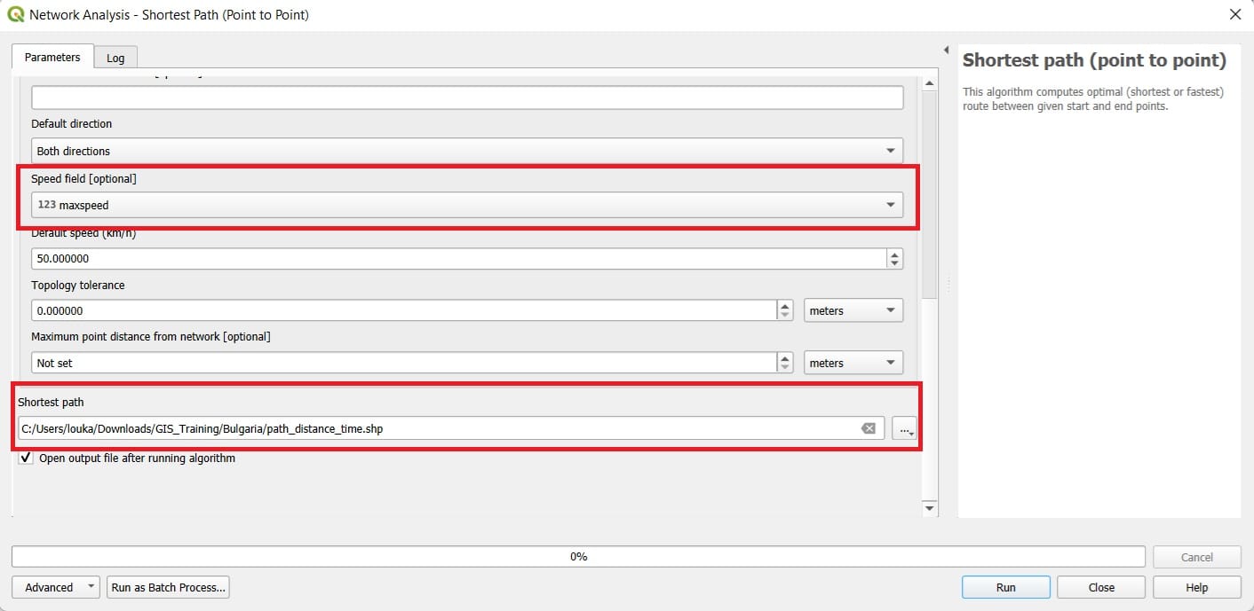
Let’s open the ‘Shortest Path’ tool. We select:
- Vector layer: roads_projected
- Path type: Fastest (this time we are looking for the fastest, not the shortest route!)
- Copy and Paste the same Start and End points
- Direction field: oneway
- Scroll down and set the Speed field: maxspeed
- Save Feature as: path_distance_time
- Click ‘Run’
To compare the results we may change the ‘path_distance_time’ layer symbology and the result will look like in the image below. The route has changed compared to the ‘shortest’ one since we are asking for the ‘fastest’ one! If you open the ‘Attribute Table’ of our new layer, you will see that the cost is 15 (compared to the 7435 of the first scenario). This time, the cost is expressed in minutes of driving from the ‘Start’ to the ‘End’ point.
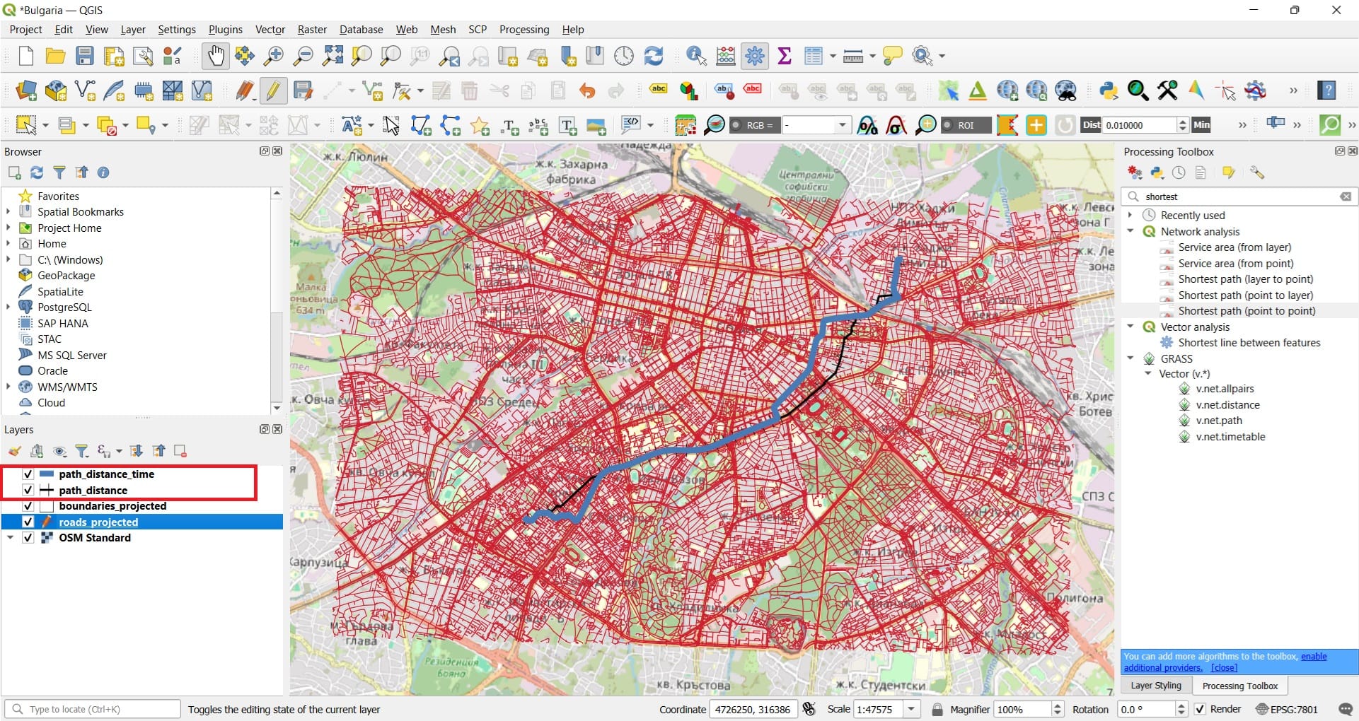
You may also zoom-in and see the differences of the optimal routes and check whether the algorithm provides realistic routes or not in terms of the selected segments, the time calculated and the ‘oneway’ restrictions. Of course, each student may check the optimal route from his home to school and she/he can decide whether she/he is coming on foot or by car/bus (by simply changing the speed limits, i.e. instead of selecting the NULL features, we can just change the speed limit value to 5 km/h for all segments by directly using the ‘Field Calculator’).
📲Service area analysis
Service area analysis in QGIS is used to identify all areas that can be reached from a specific location within a given distance or travel time. This is particularly useful for evaluating accessibility to services like schools, hospitals, or public transport stops. By analyzing road networks or pedestrian paths, service area maps help visualize which communities are within reach—and which may be underserved. This supports informed planning and decision-making in education, health, and urban development.
Let’s try one scenario now that we know how these tools work!
We should load the ‘points.shp’ for Sofia from the BBike folder we have downloaded and in the same QGIS project, we will project it to EPSG: 7801 and save it as ‘points_projected.shp’.
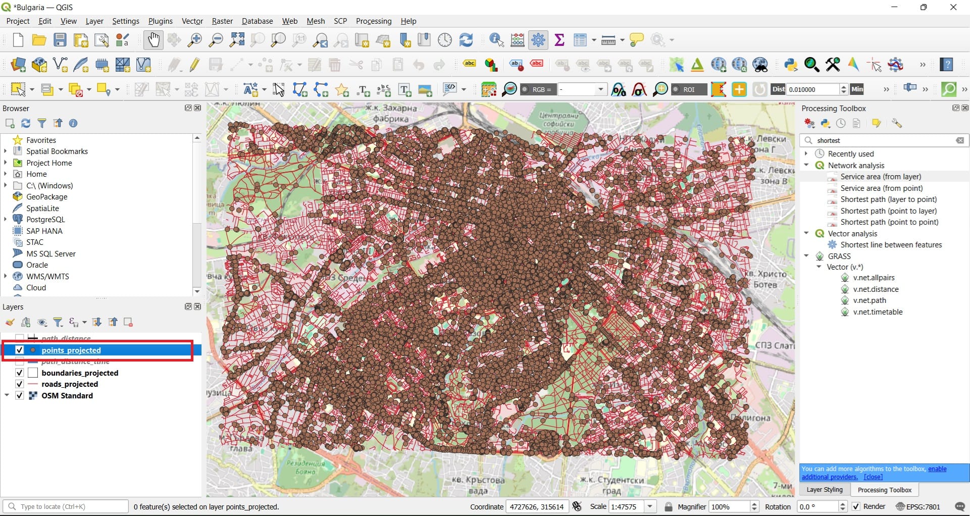
If you open the ‘points_projected’ Attribute Table, you may see that these points represent different types of facilities like hospitals, subway stations and many more.
Let’s try one scenario! We want to calculate and map which areas are within a 500 meters walking distance from the closest subway station. First, we must select all subway stations (points) in the point_projected shapefile. How? We did that before, using the ‘Select attributes by expression’!
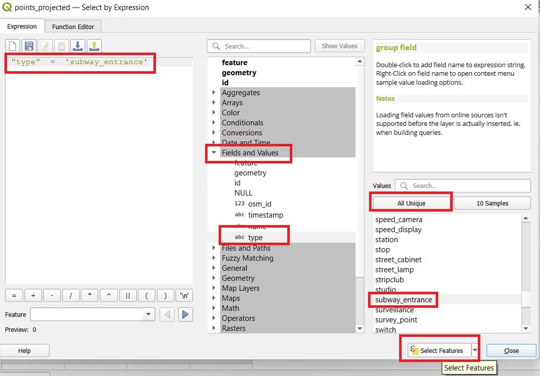
To formulate our new query we select (see the image above):
- ‘Fields and Values’ > Double-click on the ‘type’ field
- Type the equal (=) symbol
- Press ‘All Unique’ button to see all available point categories
- Double-click on the ‘subway_entrance’
- Press ‘Select Features’
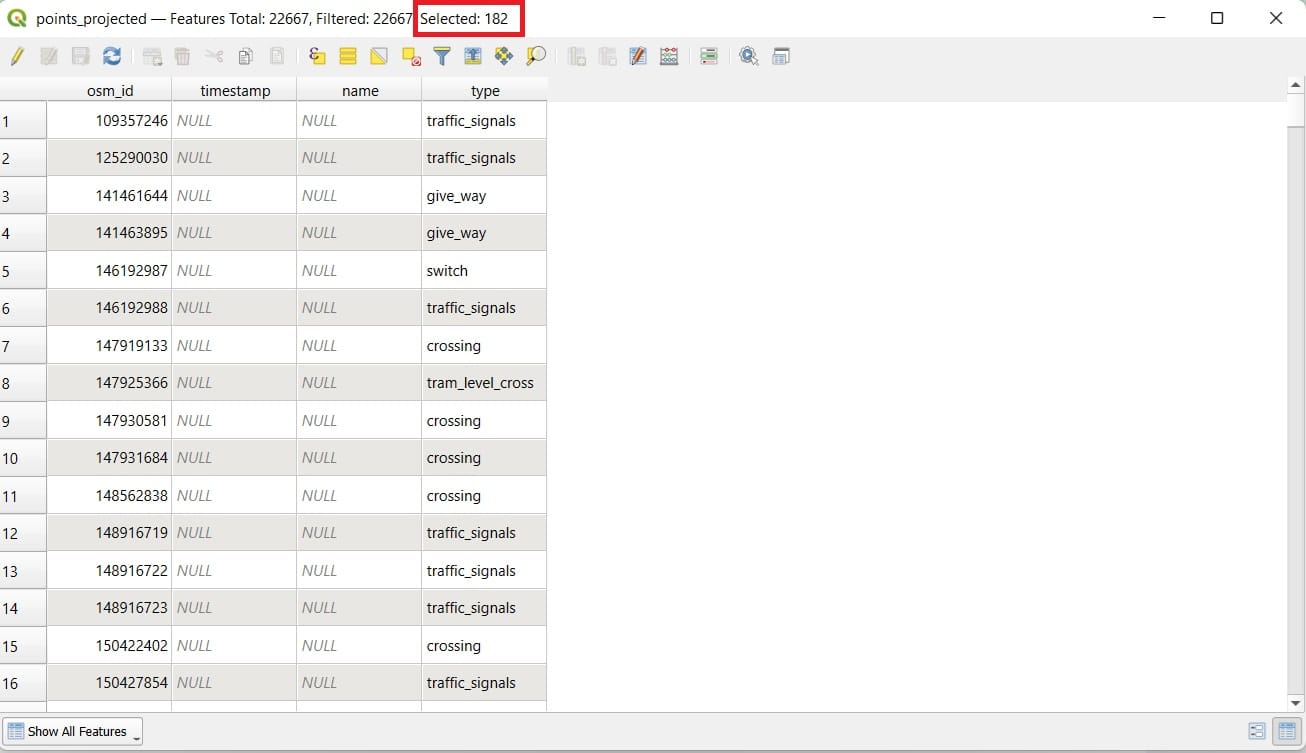
We see that 182 subway stations have been selected! Is that true? 182 is quite a lot but, in any case, let’s try our scenario. In the ‘Processing Toolbox’ tab we type ‘shortest’ but this time we select the ‘Sevice area (from layer)’ tool.
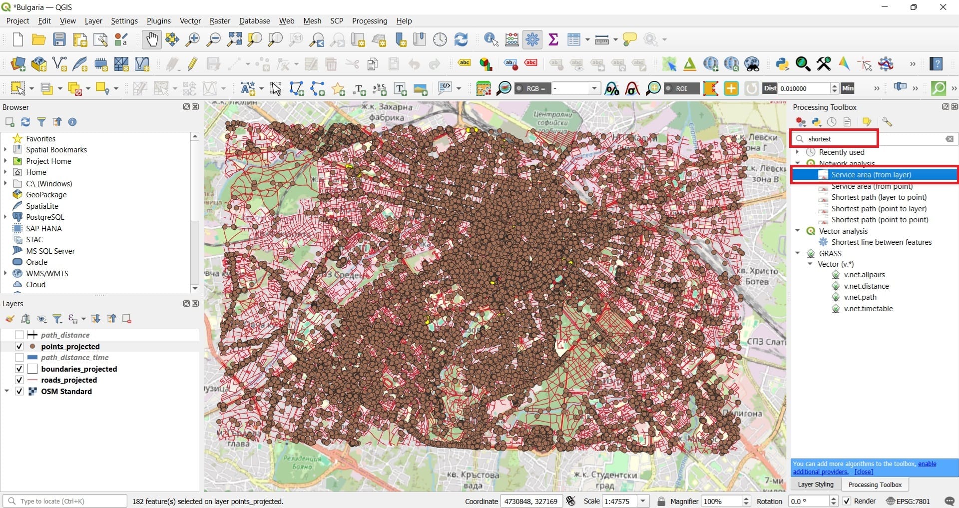
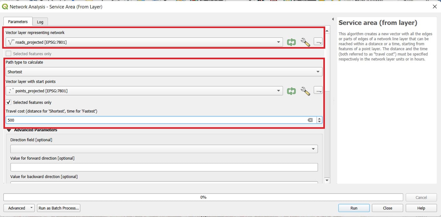
To set-up the tool we select:
- Vector layer: roads_reprojected (we need the road network to measure the walking distance)
- Path type: Shortest (distance-wise)
- Vector layer with start points: points_projected (the subway point we selected!)
- Travel cost: 500 (in meters, the maximum distance reached from each subway point)
- Scroll down and set the Default speed to ‘5’ km/h (walking speed)
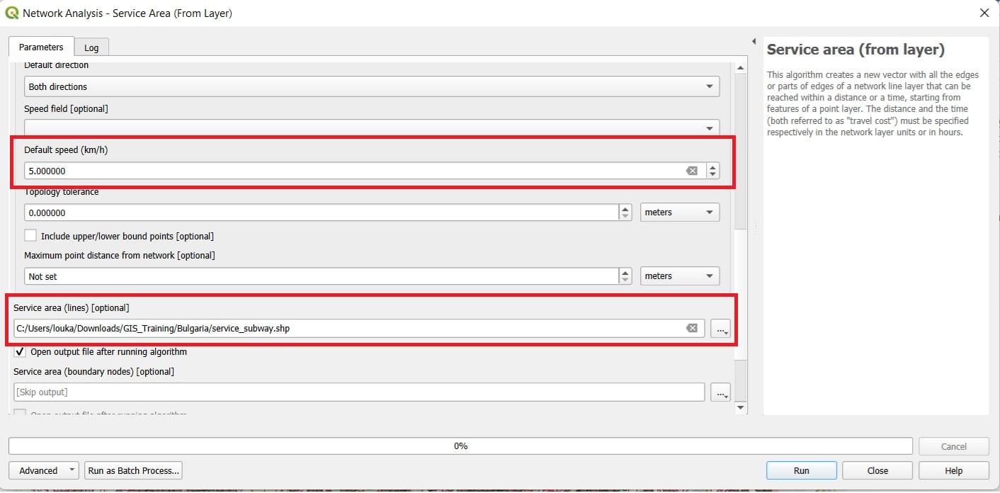
And the result will look like this…
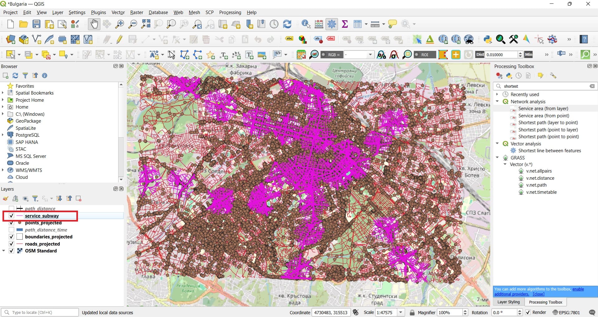
The purple colors indicate all areas within a 500-meters walking distance from the closest (in terms of the distance) subway station! Let’s try to visualize only the train stations and the service areas extracted.
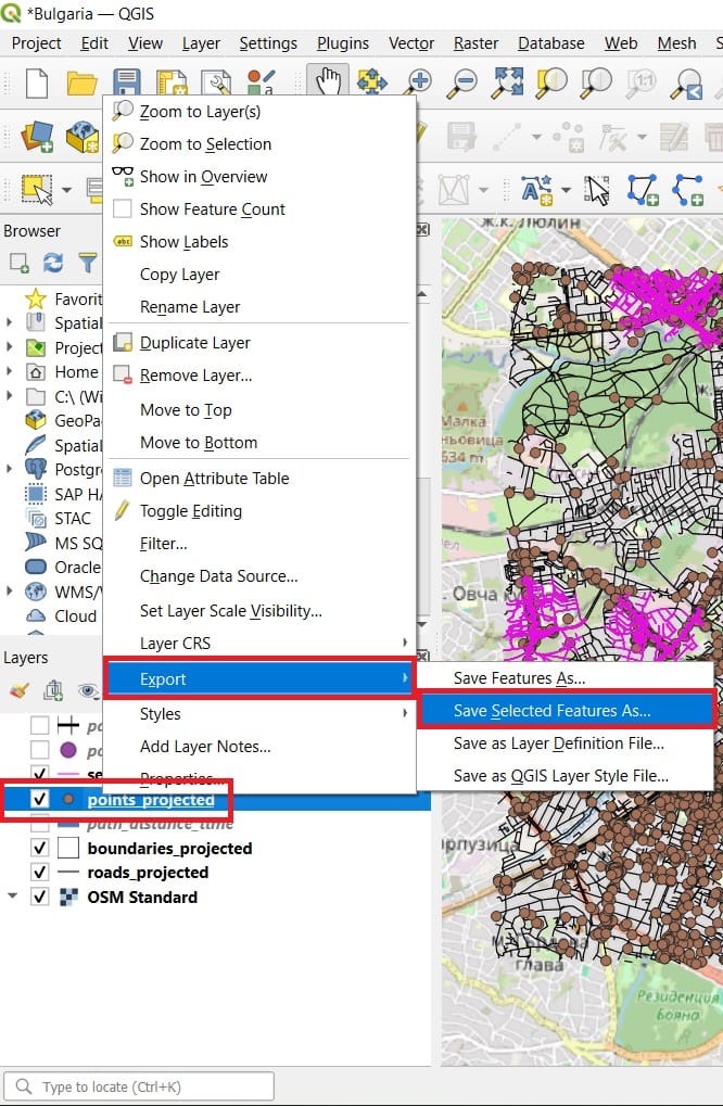
Since we have selected only the ‘subway points’ from ‘points_projected’ shapefile, we can just export and save a new shapefile including only the selected features. To do that, we right-click on the ‘points_projected’ shapefile > ‘Export’ > ‘Save selected features as..’ (see the image below).
And our final result will look like the image below! Of course, we can change the Symbology of our layers, for example, change the ‘roads_projected’ line color to black and the ‘points_subway’ to purple.
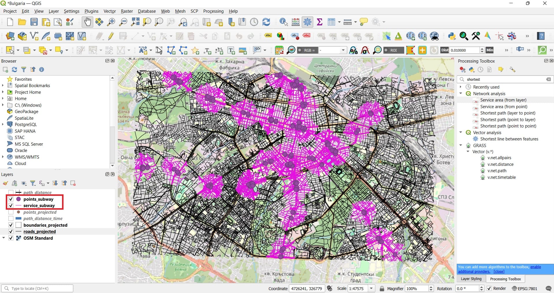
That was it! Now we know if our school or our home is within a 500-meters walking distance from the nearest subway in Sofia!
You can also check the following videos for more examples and tools on calculating shortest and fastest routes using QGIS plugins!
✅ Wrapping Up: Network Analysis in QGIS
In this lesson, you explored one of the most dynamic and practical areas of GIS—network analysis. Using real-world data from OpenStreetMap, you learned how to model movement, plan optimal routes, and simulate accessibility, much like how modern GPS systems work.
You practiced two key tools:
✅ Shortest Distance Routing – calculating the most efficient path between locations using real road networks
✅ Service Area Analysis – identifying zones that can be reached within a certain distance or time, ideal for evaluating accessibility to public services
These tools are not only useful in urban and infrastructure planning but also offer exciting opportunities for classroom-based projects that connect geography, math, sustainability, and digital skills. Well done! In the next course, we’ll dive deeper into raster spatial analysis and explore how to visualize terrain and surfaces in 3D using GIS. 🛣️📍🧭
Useful links
- W3Schools: DSA Dijkstra’s Algorithm
- QGIS: Lesson: Network Analysis
- ESRI: Algorithms used by Network Analyst
- GISGeography: Least Cost Path Analysis in GIS