Interpolation schemes
🌐 Introduction to Interpolation Schemes in QGIS
In our previous lessons, we’ve delved into raster processing and surface analysis, working with Digital Elevation Models (DEMs) to extract valuable terrain information such as slopes and aspects. Building upon this foundation, we now turn our attention to interpolation schemes—powerful techniques that allow us to estimate unknown values across a geographic area based on known data points.
✅ What You’ll Learn
- Understanding Interpolation: Grasp the concept of spatial interpolation and its significance in creating continuous surfaces from discrete data points.
- Exploring Interpolation Methods: Learn about various interpolation techniques, including:
- Applying Interpolation in QGIS: Utilize QGIS tools to perform interpolation, transforming point data into meaningful raster surfaces.
🧭 Why Interpolation Matters
Interpolation is essential in various fields:
- Environmental Science: Estimating pollutant concentrations or temperature variations across regions.
- Agriculture: Mapping soil properties or crop yields to inform management practices.
- Urban Planning: Assessing noise levels or air quality in different city zones.
Geostatistics and in particular, interpolation methods encompass a set of statistical techniques designed to analyze and predict spatial or spatiotemporal phenomena. These methods enable us to estimate values at unsampled locations and assess the uncertainty associated with these predictions. This capability is crucial in various decision-making processes, as it is often impractical to collect data at every point within a study area.
✅ What Data Can Be Interpolated?
Common examples of data that can be interpolated include:
- Digital Elevation Data: Creating digital elevation models (DEMs) from contour lines or spot heights.
- Climate and Weather Data: Estimating wind speed, temperature, precipitation (rainfall, snowfall), and humidity of a study area.
- Environmental Variables: Mapping soil properties (infiltration, nutrient content, dissolved oxygen, salinity), and air quality indices (particulate matter, ozone or carbon dioxide levels).
- Resource Distribution: Predicting the location of minerals, oil, or other resources.
✅ Exploring Interpolation Methods
Interpolation is a fundamental aspect of geostatistics, allowing for the estimation of values at unsampled locations. Various interpolation methods exist, each with its own assumptions and applicability [1, 2, 3]:
- Inverse Distance Weighting (IDW): Estimates values based on the proximity of known points, giving more weight to closer observations. This method is straightforward and effective when the influence of nearby points diminishes with distance.
- Natural Neighbors (NN): It works by identifying the closest neighbors to a query point and assigning weights based on the area of the Voronoi cell of each neighbor (see also Voronoi Diagram). It adapts well to irregularly spaced data and ensures that interpolated values fall within the range of known data points.
- Spline Interpolation: Generates smooth surfaces that pass through known data points, ideal for modeling gradual changes. Spline interpolation uses piecewise polynomials to create a smooth surface that passes through the known data points. It is particularly effective for modeling gently varying surfaces and ensures continuity and smoothness across the interpolated surface.
- Trend: Trend interpolation fits a global polynomial surface to the data, capturing broad spatial patterns. While it smooths out local variations, it is useful for identifying overarching trends in the dataset.
- Kriging: A family of advanced geostatistical methods that not only provide estimates but also quantify the uncertainty of those estimates. Kriging is not only considering the distance between known points but also the spatial autocorrelation among them. It provides both an estimated surface and a measure of prediction uncertainty, making it valuable for datasets where understanding the reliability of predictions is important.Variants include:
- Ordinary Kriging: Assumes a constant mean across the study area.
- Universal Kriging: Accounts for trends by modeling a varying mean.
- Simple Kriging: Assumes a known mean value.
- Indicator Kriging: Used for categorical or binary data.
- Empirical Bayesian Kriging: Incorporates Bayesian statistics to improve prediction accuracy.
Each method has specific requirements and is suited to different types of data and analysis goals. Of course, we are not going to analyze the interpolation methods in depth since it’s a complex geostatistics field. However, for educators, introducing interpolation methods offers students a powerful framework for understanding spatial variability and making predictions in the face of uncertainty. Hands-on exercises using GIS softwares can help students grasp the practical applications of these methods.
For students, testing different geostatistical techniques enhances analytical skills and provides valuable tools for various fields, including environmental science, urban planning, and public health. Engaging with real-world datasets and scenarios fosters critical thinking and problem-solving abilities!
🌐 Interpolation concept in a nutshell
Tobler’s first law of geography (TFL) refers to the statement made by Waldo Tobler in an article published in 1970: “Everything is related to everything else, but near things are more related than distant things.”
Based on this, spatial interpolation is used for estimating unknown values at specific locations based on known data points. While the mathematical underpinnings of interpolation methods can be complex, understanding their general characteristics and appropriate applications is crucial for effective spatial analysis. Let’s see some differences visualized in the image below [1]:
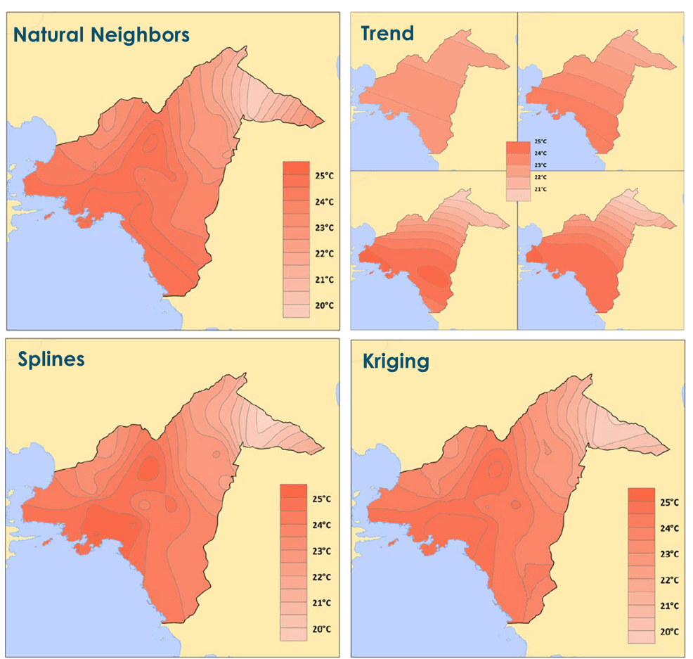
The image above showcases four different interpolation schemes, namely, Natural Neighbors, Trend, Splines, and Kriging, applied to the same geographic area (Athens Metropolitan area) to estimate temperature distribution. Each method produces a slightly different visual result, highlighting the variability in how spatial data can be modeled.
The Natural Neighbors interpolation offers a smooth, moderate representation that closely follows the original data points, maintaining local variations while avoiding overly sharp transitions. The Trend method, as seen in the four smaller panels, uses polynomial fitting and tends to smooth out local differences, producing more generalized surfaces that can miss finer details. The Splines interpolation provides a smooth surface that bends to fit all data points exactly, resulting in a more accurate representation. It often captures local variations (small circles) well but can sometimes introduce artifacts, such as over-smoothed or exaggerated zones. In contrast, Kriging, which also creates a smooth and statistically optimized surface, offers a balance between local detail and overall structure. It accounts for spatial autocorrelation, which helps provide a more accurate estimation of values, especially when the input data is unevenly distributed.
Overall, the choice of interpolation method significantly affects the visual output and interpretation. While Natural Neighbors and Kriging strike a balance between precision and smoothness, Trend simplifies the data into broad patterns, and Splines emphasize continuity and exact fits. Each method has its strengths depending on the spatial context and purpose of analysis.
Now let’s try some interpolation methods on data for Austria!
There are 2 options to download or create (create??) weather data for Austria. The first one is to use an amazing QGIS Plugin called ‘Austrian Weather API’! Do you remember in the previous lessons that we analyzed how we can download data using different services (OGC Services – WMS,WFS, WCS etc.) or APIs? Well, now it’s the time to use the API option.
First we can install the ‘Austrian Weather API’! To do that, we can load the QGIS Project for Austria and select > ‘Plugins’ > ‘Manage and install plugins’.
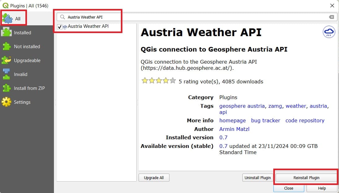
You type ‘Austria Weather API’ > select the plugin > ‘Install’ (in the image above you see reinstall because the plugin is already installed).
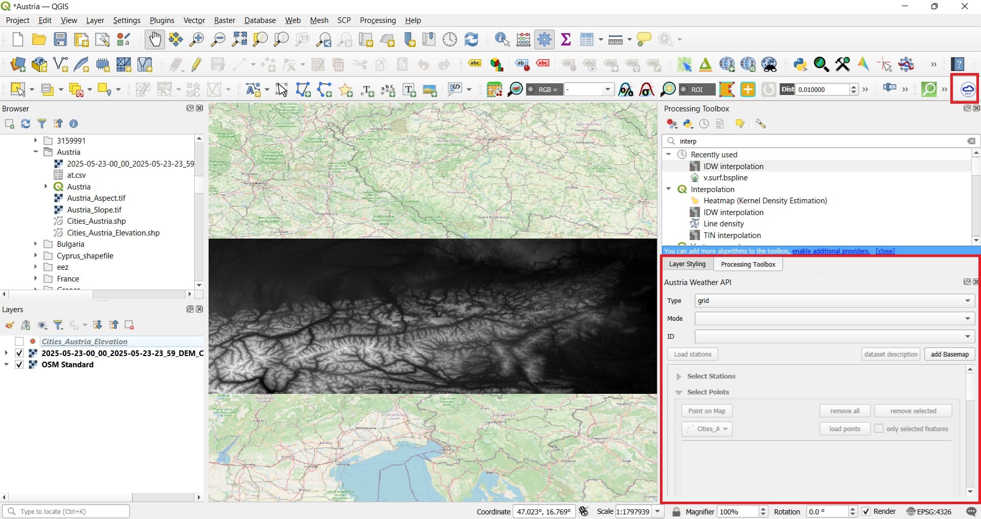
To load the plugin, you may use the rainy cloud icon on the top-right QGIS toolbar or alternatively, by selecting ‘Plugins’ > ‘Austria Weather API’ and the plugin window will load on the bottom-right corner.
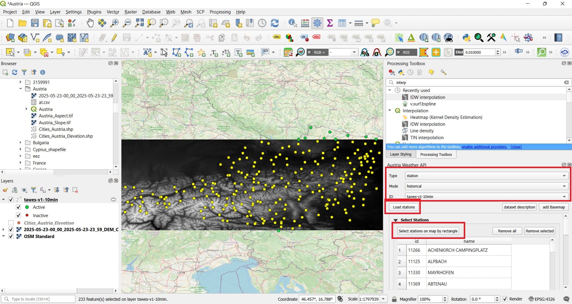
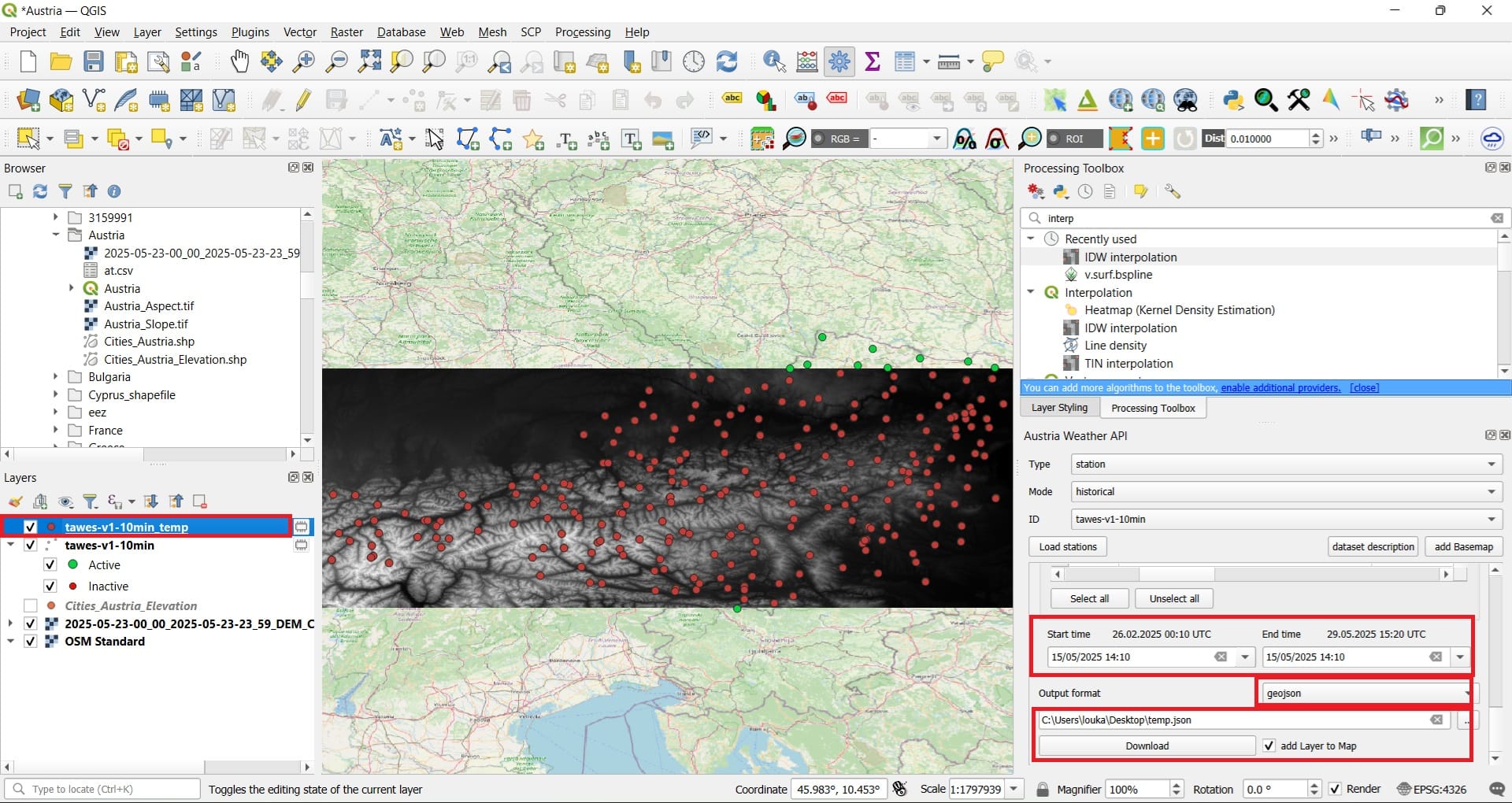
To download data using the ‘Austria Weather API’ we need to set-up a few parameters like is shown in the images above. Hence, we select:
- Type: Station (data from meteorological stations)
- Mode: Historical (measurements of the past)
- ID: tawes-v1-10min (which means: daily 10-minutes average values)
- We press ‘Load stations’
- We press ‘Select stations on map by rectangle’
- Select parameters: TLMAX (maximum temperature)
- Start and End time: whatever you prefer (in the example here we select 15/05/2025 14:10)
- Output format: geojson (similar to the shapefile format)
- Save as temp.json
- We press ‘Download’ and we also click the checkbox ‘Add Layer on the Map’
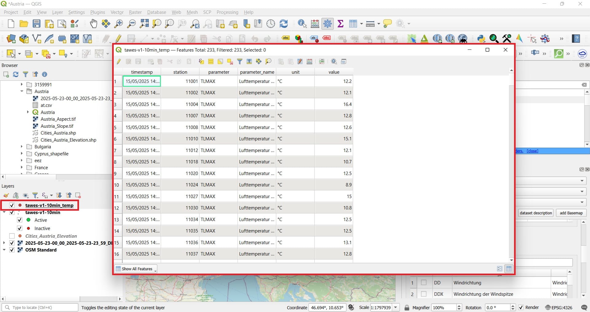
That was it! Our point data have been loaded! If you open the ‘Attribute Table’ of the layer loaded ‘tawes-v1-10min-temp (we also have saved our file in .geojson format), we will see all information stored including the time and date, the station name, the parameter (temperature), the iunits and the value.
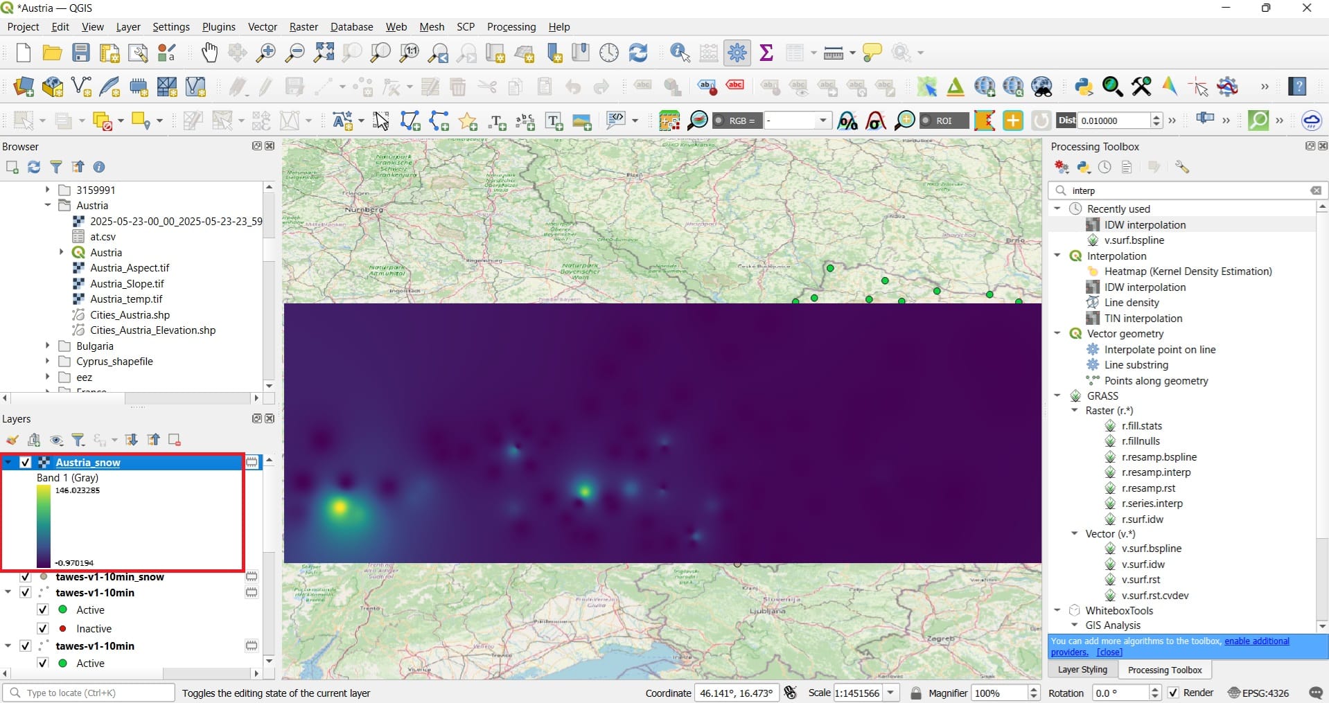
Let’s try to interpolate those values to create a raster surface of temperatures!!!

By typing in the ‘Processing Toolbox’ search bar ‘interpolation’, we will see many different interpolation tools. One of them is ‘IDW interpolation’ which uses the Inverse Distance Weighting interpolation scheme. Let’s try it.
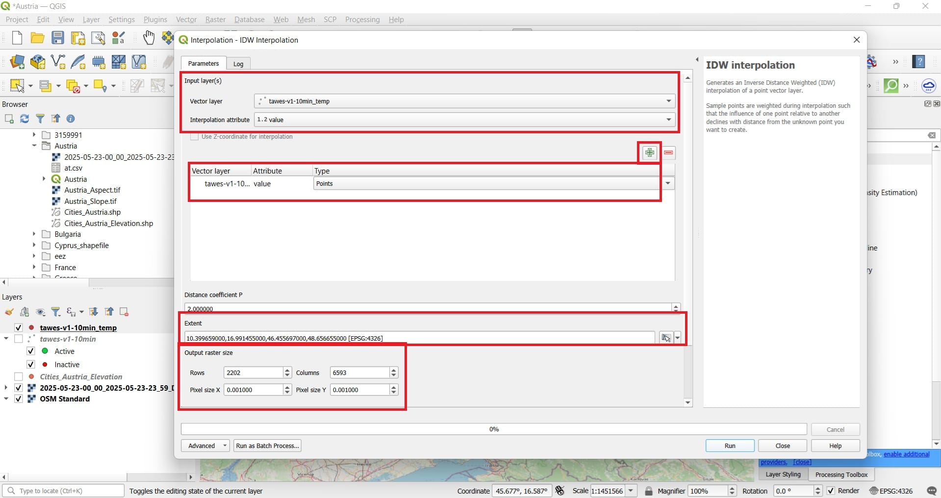
We select:
- Vector layer: tawes-v1-10min-temp
- Interpolation attribute: value
- We press the ‘+’ icon to add the data!
- Extent: We select ‘Same as layer’ > we select the DEM layer ‘2025-05-23-00_00_2025-05-23-23_59_DEM_COPERNICUS_30_DEM’
- Output raster size: we type 0.001 on the second cell and automatically the rows and columns will be calculated. You may also use a cell size of 0.01 to reduce the processing time (the image will be smaller in size due to the decreased number of cells).
- We save as ‘Austria_temp’
And the result will look like this…..feel free to change the Symbology to > ‘Singleband Pseudocolor’ > Color ramp: Turbo > Mode: Equal Interval > Classify.
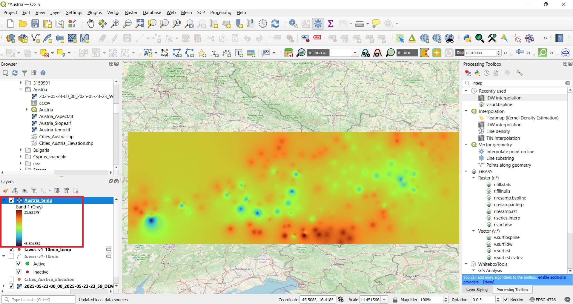
You have just created a high-resolution temperature map for Austria! Ok, it’s just for the 15th of May 2025 but still, you may create a temperature map for any day you want and most importantly….for any variable, including precipitation, snow, wind etc.
The blue colors indicate areas of high altitude and this explains the lower temperatures (-5 Celsius degrees). The highest temperatures are observed in the south (probably that’s normal). You may also ask your students to present the weather daily report! Some teams may interpolate temperature values and some other teams, the wind and the precipitation surfaces.
If you try to interpolate the snow volume for 27/02/2025 00:00 the result will look like this (Symbology > Viridis)…
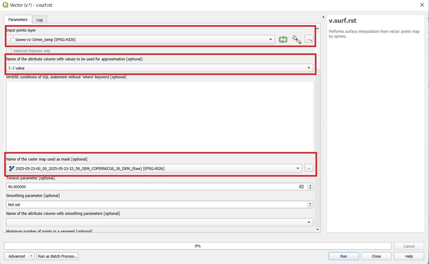
Also, for inter-comparison purposes, you may try different interpolation schemes, for example, the ‘Splines’ interpolation by selecting > ‘v.surf.rst’ tool.
You select:
- Input layer: tawes-v1-10min-temp
- Name of the attribute…: value
- Name of the raster map used as mask: 2025-05-23-00_00_2025-05-23-23_59_DEM_COPERNICUS_30_DEM
- You save as ‘Austria_temp_splines’
- You press ‘Run’
The result might look a bit more impressive….
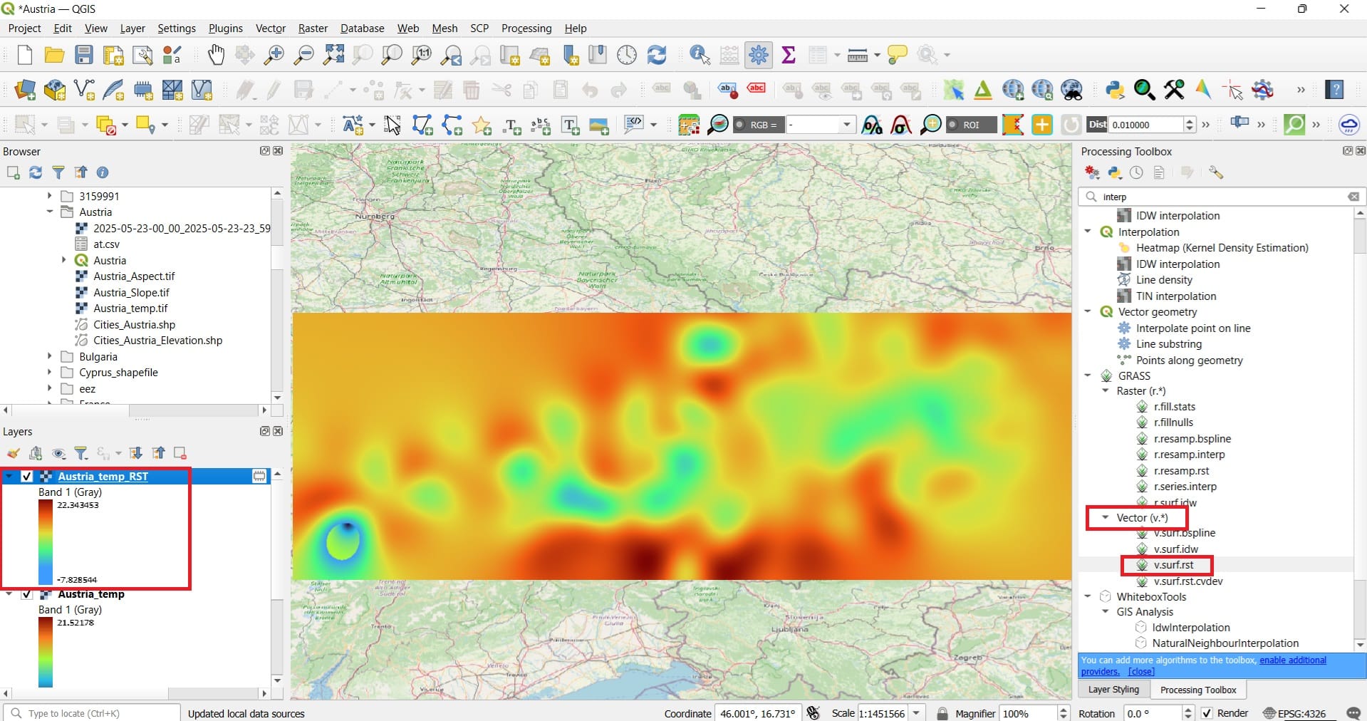
As we mentioned in the beginning of our lesson, Spline Interpolation generates smooth surfaces that pass through known data points, ideal for modeling gradual changes. The result looks like a professional weather map, what do you think?
✅ Wrapping Up: Interpolation Schemes in QGIS
In this lesson, we explored how interpolation techniques in QGIS allow us to turn scattered point data—such as temperature or snow measurements—into continuous raster surfaces. Building on your knowledge of raster processing and terrain modeling, you learned how interpolation fills the gaps between known data points and helps us better understand spatial patterns across a landscape.
You tested key methods such as:
✅ IDW (Inverse Distance Weighting) – a simple yet effective technique that assumes nearby points have more influence on the interpolated value.
✅ Splines – a smoother interpolation method that creates continuous, gradual surfaces ideal for modeling natural phenomena like temperature or elevation.
By applying these tools in QGIS, you created raster surfaces for variables like temperature and snow volume, simulating real-world spatial variation using data points across Austria or other European countries. But, we highlighted that the API we used is only for Austria, what if we want to find data for other countries?
Finding data for other countries is always possible, depending on the data availability per country. Yet, you can always create some dummy data for your students! How? Just use a Generative AI platform! You may ask from an AI platform the following:
”Can you create 50 coordinates in lat,lon format for Greece with some random summer temperatures. The format should be: Lat, Lon, Temperature for a .csv file. Please consider the altitude difference (i.e. via the Digital Elevation Model) while generating the temperatures, for example, a point with altitude 1200 meters should have way lower temperature than a point with 50 meters altitude. I wanna download it in .csv format. Try to cover all Greece”
The Generative AI platform is capable to produce a .csv file you can instanlty download! You may find one we have created for Austria attached in the lesson material!
Useful links
- Kokla, M., & Nakos, B. (2024). Thematic Cartography [Undergraduate textbook]. Kallipos, Open Academic Editions. https://dx.doi.org/10.57713/kallipos-981
- ESRI: Comparing interpolation methods
- Carto: Spatial interpolation: which technique is best & how to run it